11 Tips for Designing a Good Logo
![]() Rocío Cortázar · 12 Feb, 2026 · Diseño Gráfico · 7 min
Rocío Cortázar · 12 Feb, 2026 · Diseño Gráfico · 7 min

The logo is a fundamental part of the brand identity, it’s the face of your company, its visual representation. A good logo should be able to convey the essence of the brand and be instantly recognizable by its customers. It is a crucial element that establishes a large part of the brand’s identity and creates a memorable impression. But as you might imagine, achieving all this is not an easy task. It requires creativity, design knowledge, a deep understanding of the brand, attention to details… So in this article, we will look at some tips that will help you create a solid and memorable logo that effectively represents the brand.
Brief clarification: in this article, we will use logo/logotype as generic terms without distinguishing between imagotype, isologo, logotype, and isotype to facilitate reading.
1. Know the brand thoroughly
The first step to creating a logo should always start with knowing the business thoroughly. Ask important questions like:
- What is its mission and vision, history, values…?
- What needs does it aim to meet in society?
- Who is its target audience?
Studying the main competitors is also very important. Both to know what the differences and similarities of the brand are with these other companies and to detect possible opportunities in the niche to stand out.
All this deep knowledge will guide your decisions when designing and will allow you to create a logo that resonates with the brand’s personality and objectives.
2. Don’t go overboard
Simple logos are always more successful, versatile, and above all, more memorable and recognizable. Don’t clutter your designs with unnecessary details or elements that add nothing to the whole. Instead, opt for clean, clear, and legible shapes.
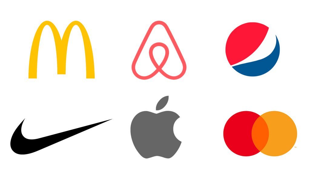
Don’t forget to do reduction tests to see how well the design works in smaller sizes. If you lose legibility or it becomes unclear, keep simplifying. A simple logo will be more versatile and have better adaptability to different applications and platforms.
3. Versatility matters
The logo should look just as good on a huge billboard as it does on a pen. It should successfully adapt to different media and sizes. If the design scales easily without losing visual impact, you’re on the right track.
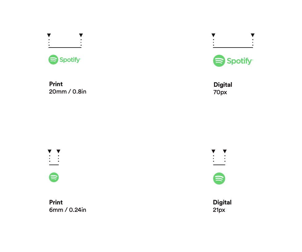
So don’t hesitate to do different tests to ensure it does. A versatile logo will save you time and effort in the long run.
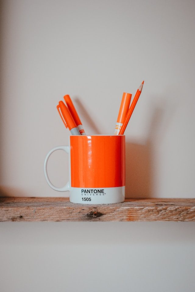
4. Choose your logo colors wisely
Color is a fundamental part of brand perception. Each color has emotional, psychological, and cultural associations (keep this last one in mind if your product/service will be available in different countries, you don’t want to use a color with a negative connotation). So research these associations thoroughly and select those that align best with the brand’s personality, the sector, and the target audience. Don’t go overboard with colors either; try not to use more than 3, and as a recommendation: avoid gradients, as they can cause headaches.
And of course, don’t forget to create a negative version (one that works well on dark backgrounds) and another in black if it’s a color logo.
On our blog, we have 3 articles about color theory that I leave below, in case you want to learn everything you need to know about this topic:
- Color Theory – Part I – The Meanings of Colors
- Color Theory – Part II – Basic Properties of Color
- Color Theory – Part III – Creating Color Schemes
5. Don’t neglect your logo’s typography
If your logo contains text (as is the case most of the time), please choose a good typography.
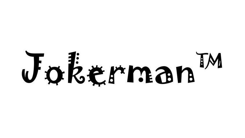
The fundamental thing is that it reads well, so forget about choosing one that is extravagant or with many flourishes. And if it’s a typography that is consistent with the brand, even better. Do different tests and study which option best conveys the brand’s values and personality. You’ll be surprised at how much things can change just by changing the typography.
If you want to give it a special touch, you can always make variations and customize it so that the logo is unique and memorable (there are probably already more than one logo with the typography you’ve chosen). However, be careful, don’t overdo it because we can end up ruining legibility or adding trivial details that don’t really contribute anything to the design.

Since our blog is the best, we also have a guide for you to learn how to choose a good typography: Typography 101: Complete Guide to Choosing One.
6. Don’t design your logo with trends in mind
Trends come and go, and while it’s tempting to follow them when designing a logo, doing so condemns you to having to redesign sooner than necessary, as it will look outdated and obsolete after a while. Moreover, you risk it resembling a bunch of other logos created with those same trends in mind.
Instead of following trends and having a super modern logo (for a year), it’s much better to create a timeless design that endures over time and maintains its relevance over the years.
7. Be original
For your logo to stand out, it’s important that it be unique and distinctive, especially from your competition, which is why it’s so important to study it beforehand. If your logo is too similar to another company’s in the sector, it can cause confusion and negatively impact the brand’s credibility. It’s okay to seek inspiration (and it’s totally normal), but never copy; create something entirely new and original.
8. Test and adjust, test and adjust…
Never settle for the first ideas, because they are usually the most obvious, the ones everyone has already thought of. Start sketching (with paper and pencil), select the ideas you like the most, and keep testing, adjusting, and iterating. Experiment with different concepts and ask acquaintances to see what opinions the design evokes. As a personal tip, I recommend never showing this process to the client; only show them the final product.
Sometimes, a small adjustment can make a big difference in the effectiveness of a logo.
9. Logo versions
It’s essential to ensure that the logo works well in its grayscale, black and white versions. These are fundamental versions, especially the black and white ones. This will ensure that the logo looks good in situations where it cannot be used in its color version because the background doesn’t allow it (because it’s a very similar color, for example).
It’s also important to have different versions of the logo in terms of proportions: a main version, which can be more elongated (horizontal), another that is more vertical, and one that is more square (ideal for use on social media)…
10. Consistency is key
Creating the logo is as important as its use. It’s essential that it be used consistently in all its applications, whether on social media, prints, websites, physical products… If used consistently, the brand’s identity will be strengthened and its recognition will increase.
When I talk about this topic, the example I always use is Coca-Cola. Think for a moment about all the media where the Coca-Cola logo appears; isn’t it always the same and recognizable? Consistency.

11. There should always be a vector version
Vector versions of logos are fundamental because they ensure total scalability without any loss of quality. Therefore, it’s very important to always have them on hand.

If you don’t know what the vector format is, here’s an article so you won’t be left wondering: Bitmap and Vectors, What Are They and Which Should I Choose?
And if you have doubts about which are the vector formats, here’s another one where you have the most common ones. My goodness, all that you’re learning in this post, right?
Conclusion: How to Design a Good Logo
I imagine that after reading this article, you’re realizing how complicated it is to create an effective logo, a challenging but always rewarding process. The logo shouldn’t just be “pretty”; it should symbolize the brand’s values and promises, capturing its essence.
Doing a good job can make a difference in a brand’s perception and its success in the market. Remember that simplicity, versatility, originality, and consistency are key in logo design. Combined with a deep understanding of the brand, this will allow you to create one that leaves a lasting impression.

 Graphic Designer in Your Company")


