30 Graphic Design Terms You Should Know
![]() Rocío Cortázar · 11 Jun, 2025 · Email Marketing · 6 min
Rocío Cortázar · 11 Jun, 2025 · Email Marketing · 6 min

In the interconnected world of marketing and graphic design, mastering basic terminology is not just useful—it’s essential to ensure effective communication and the successful execution of creative projects. That’s why today we’re bringing you 30 graphic design terms you need to know.
Whether you’re writing a brief for a designer, deciding on the aesthetics of a campaign, or simply want to better understand creative proposals, knowing the specific language of design can make a big difference.
In this article, we break down 30 graphic design terms that every marketer should know to facilitate collaboration, improve strategic discussions, and strengthen every visual element of their campaigns.
Typography
Typography is one of the first graphic design terms you should know, as it involves the study and design of typefaces, including their style, arrangement, and appearance.
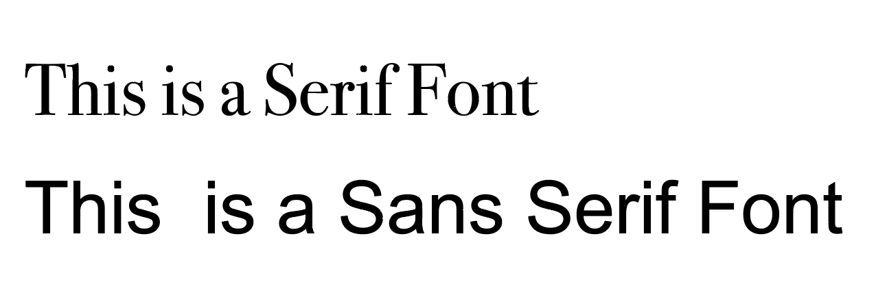
Serif and Sans Serif Fonts
Serif fonts have small strokes at the ends of characters, giving a more formal and traditional look. Sans serif fonts lack these strokes, resulting in a simpler, cleaner, and more modern style.
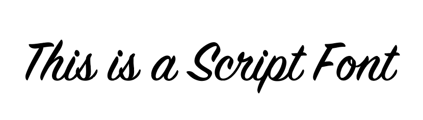
Script Fonts
Script fonts are based on handwriting and convey a sense of fluidity and authenticity.
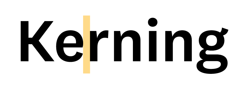
Kerning
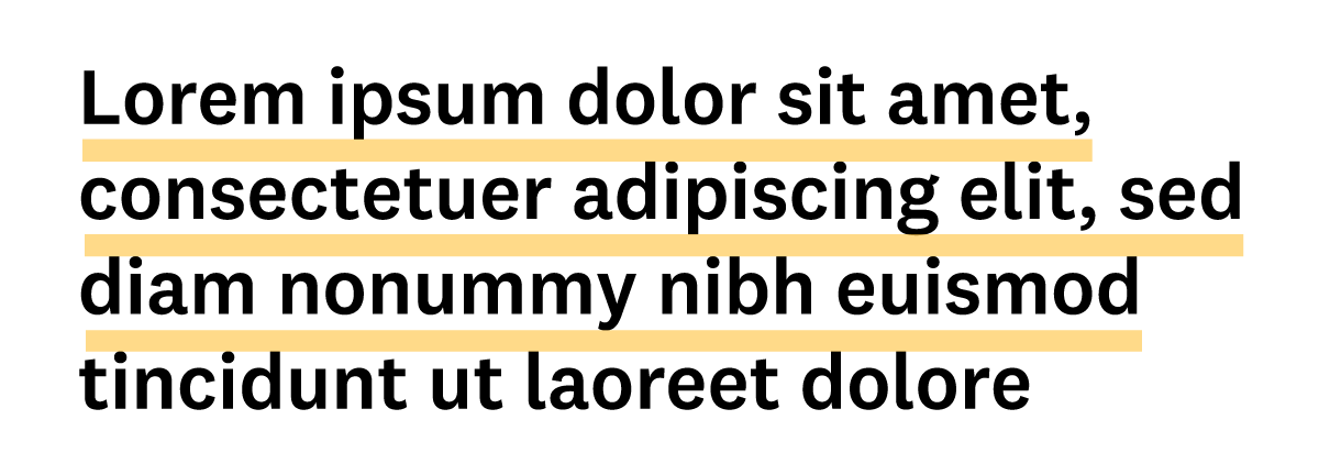
Kerning refers to the spacing between two specific characters (letters, numbers, or punctuation). Proper kerning adjustment greatly improves legibility.
Leading (Line Spacing)
Leading is the distance between lines of body text, from the baseline of one line to the baseline of the next. Adjusting leading is key for proper reading.
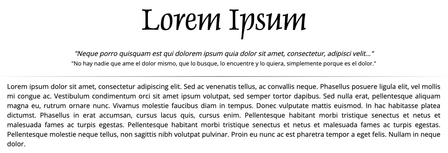
Lorem Ipsum
Lorem ipsum is a placeholder text used in designs that don’t yet have final copy. It gives a more realistic idea of the typography than repeating “Insert your content here.” It is said to be taken from Don Quixote, although the most widespread and accepted version in the industry is lorem ipsum.
Branding
Branding is the process of creating a unique and coherent identity for a company or product, including visual elements like logos and color palettes.
Logo
The logo is the visual element that represents the identity of a company. It can be composed of images and/or text. Technically, we distinguish between:
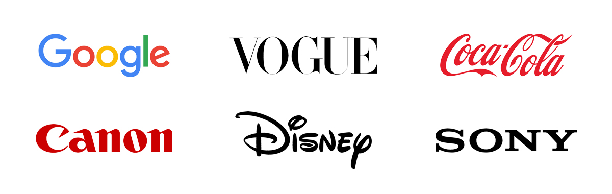
Logotype: Composed only of typography. Examples: Coca-Cola, Walt Disney, Canon.
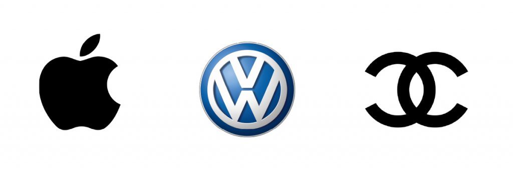
Isotype: A symbolic or iconic representation of the brand that can function independently. Examples: Apple, Volkswagen, Chanel.
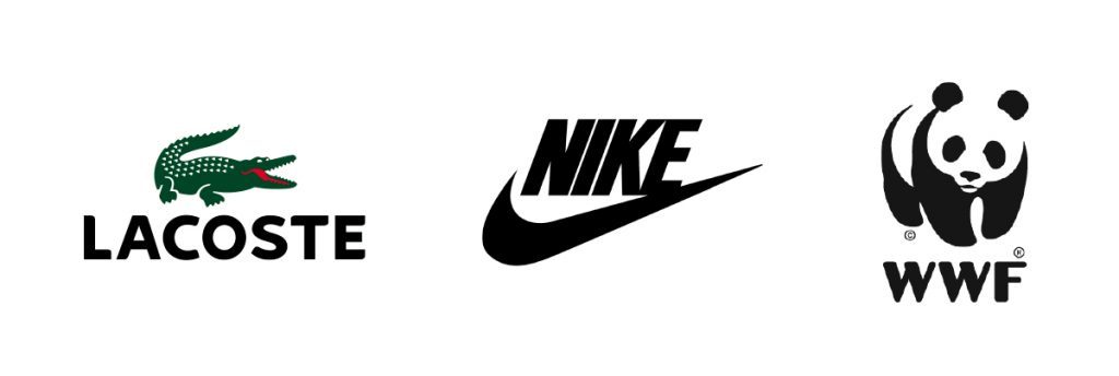
Imagotype: A combination of logotype and isotype, where both can be used separately. Examples: Nike, Lacoste, WWF.
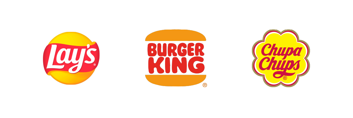
Isologo: A combination of typography and graphic symbol that cannot be separated. Examples: Burger King, Lay’s, Chupa Chups.
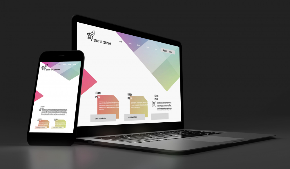
Mockup
A mockup is a full-scale or realistic visual representation of a design. It allows clients and designers to evaluate how the design will look in its final context.
Pixel
The smallest dot or unit in a raster or bitmap image. It’s used in digital screens and determines the resolution of the image.
Vector
Vector images are made with mathematical formulas that define shapes. These consist of lines, points, and polygons, and can be resized without losing quality.
Resolution
Resolution refers to the density of pixels in a digital image. It’s usually measured in ppi (pixels per inch). The higher the resolution, the sharper the image—though the file will be larger. Low resolution can result in pixelated images.
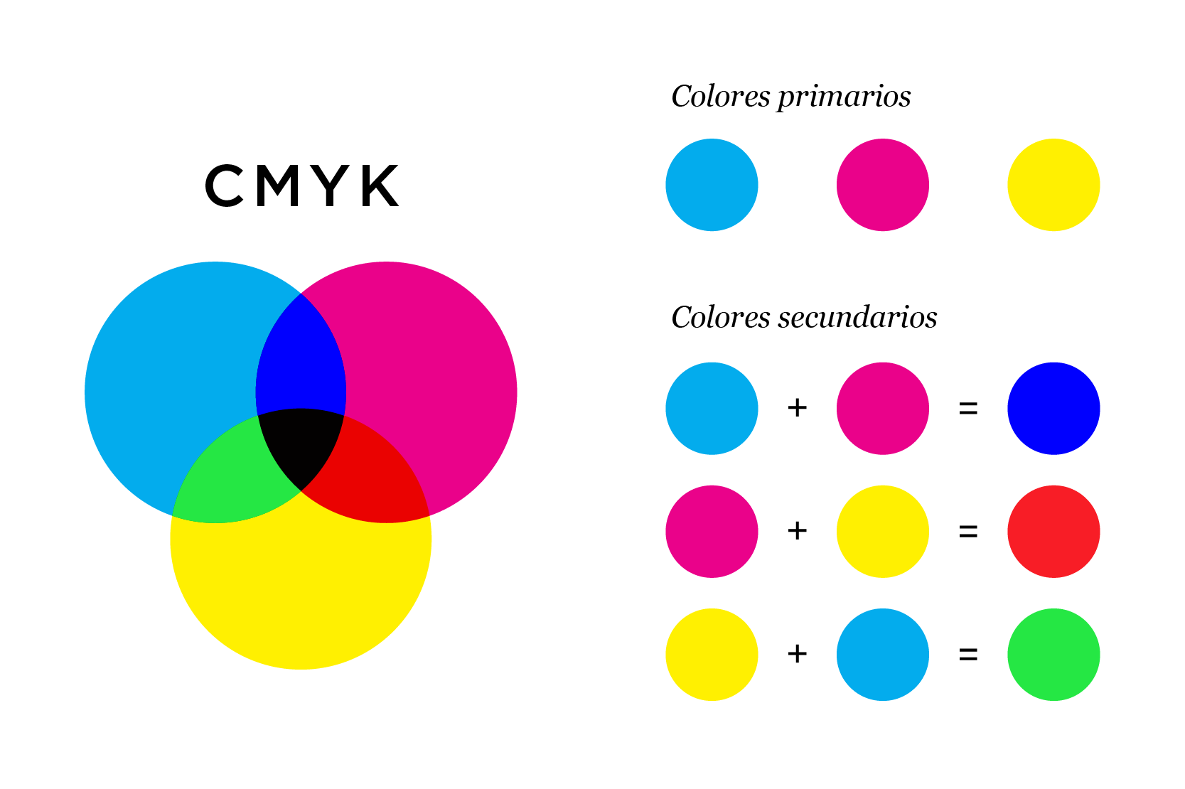
CMYK
A color model used in printing. It uses four base inks: Cyan, Magenta, Yellow, and Black.
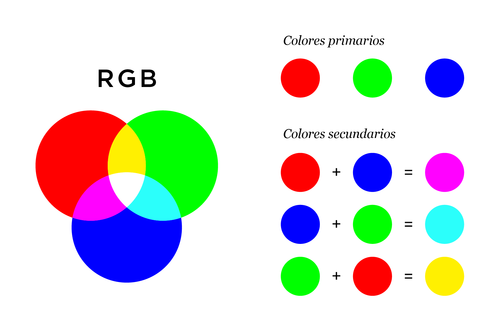
RGB
A color model used in screens and digital devices. It mixes red, green, and blue light to produce colors.
HEX / Hexadecimal
A color representation system used in web environments. It corresponds to the RGB color model and is expressed in six alphanumeric characters.
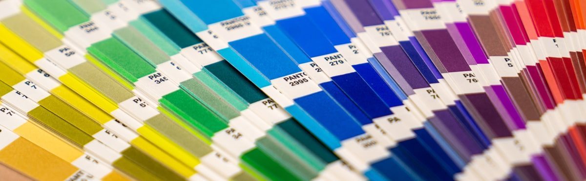
Pantone
Pantone is a standardized color catalog that assigns codes to solid colors. It ensures consistency across different media and printers. It’s especially useful in printed materials like stationery, packaging, textiles, etc.
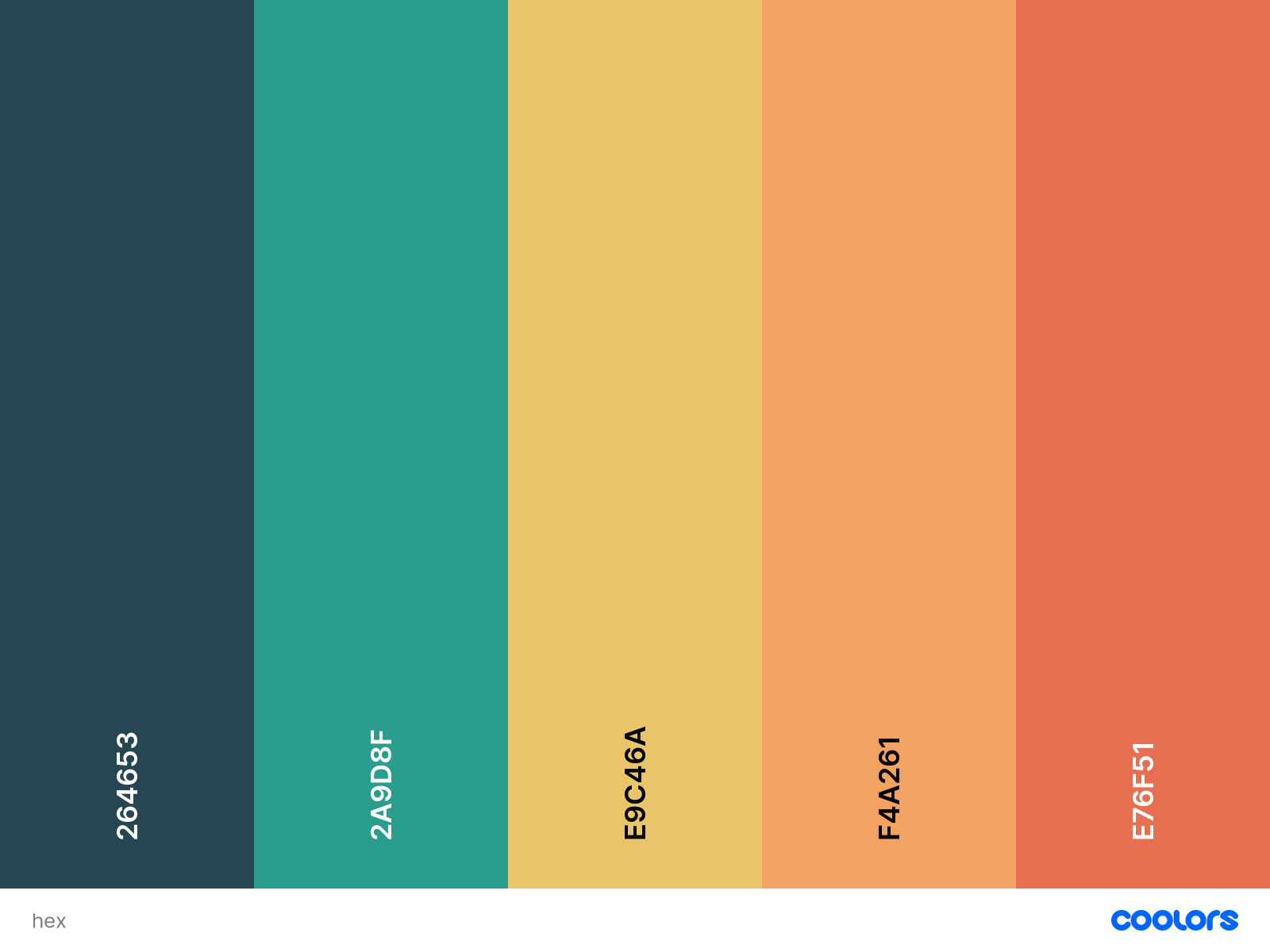
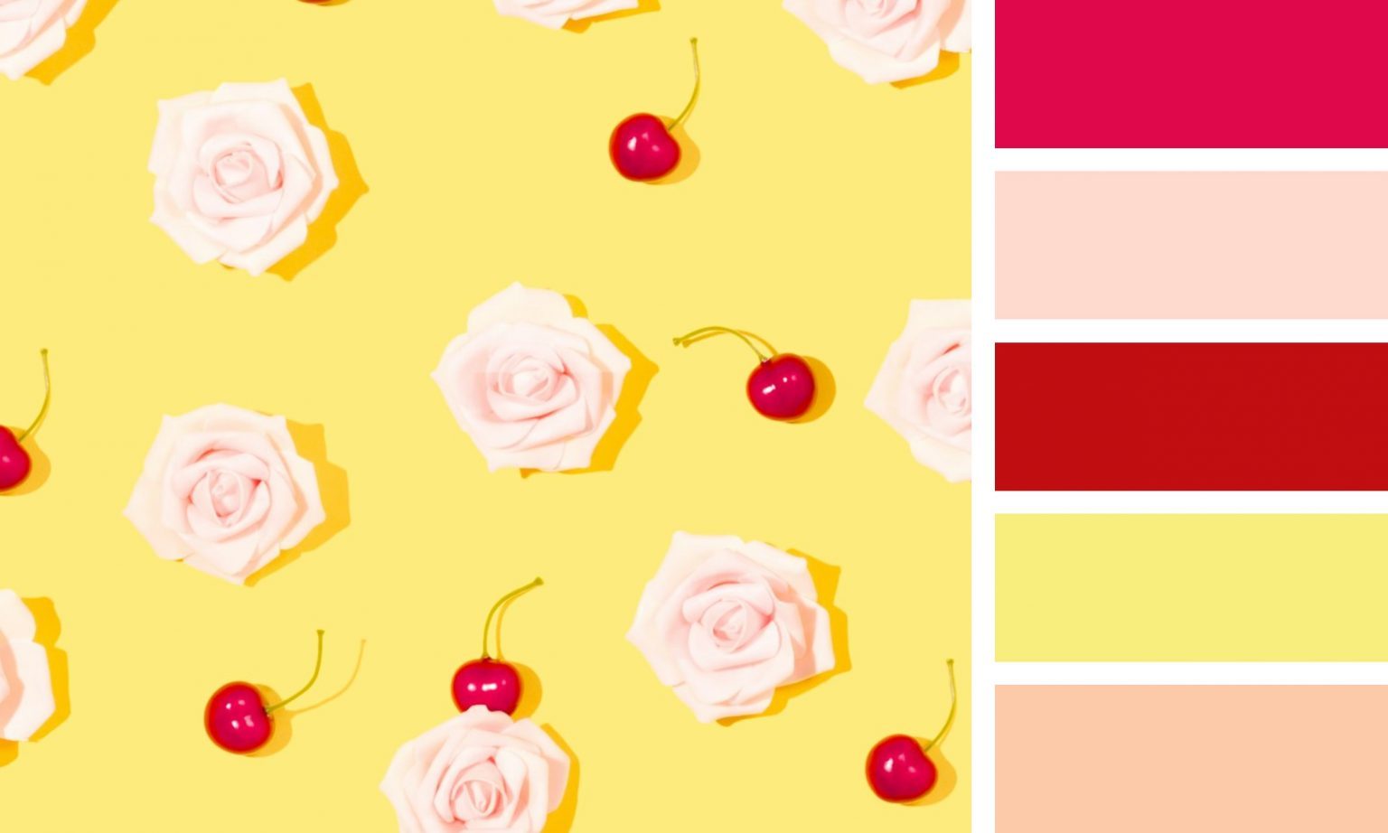
Color Palette
The set of colors chosen for a design to maintain visual coherence and express a specific message. Here you can learn how to create a color palette.
Contrast
The difference in brightness or color between elements in a design. High contrast (e.g., black text on a white background) is visually striking and can be used to draw attention.
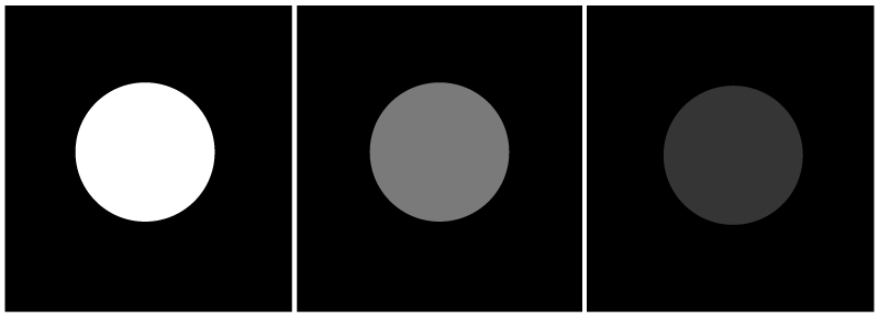
Saturation
Saturation refers to the intensity or purity of a color. The more gray a color has, the lower the saturation; the purer the color, the more saturated it is.

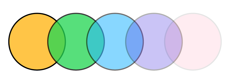
Transparency
Transparency refers to how visible an image or color is. An image with high transparency (low opacity) allows other elements underneath to show through.
Negative Space
Negative space is the empty or unoccupied space in a design. It’s essential for readability and balance. A design without “breathing room” can be overwhelming.

Infographic
An infographic is a visual representation of information or data that combines illustrations, charts, and short text to make complex information easier to understand.
Banner
A banner is a rectangular image used in digital advertising. It’s typically placed at the top or sides of web pages and can include images, text, and interactive elements.
Layout
Layout is the process of organizing text and images in a visually appealing and structured way, both in print and digital formats.
Composition
Composition refers to how different elements are arranged in a design to form a balanced and cohesive whole.
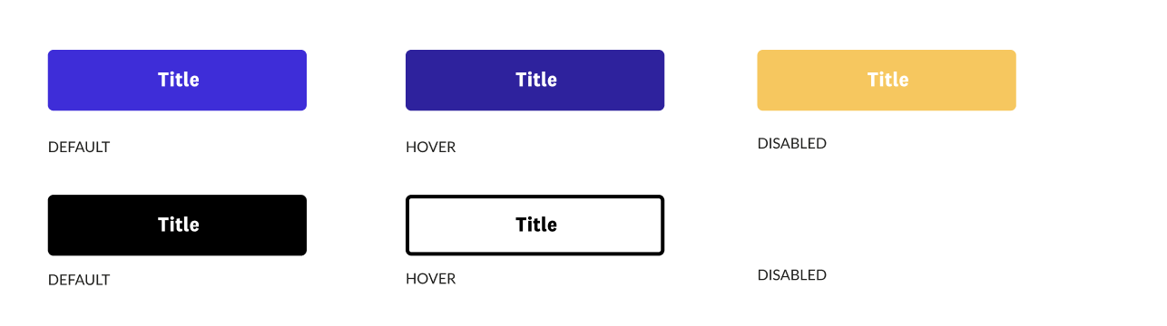
User Interface (UI)
UI refers to the set of visual and interactive elements (buttons, menus, icons, etc.) that allow a user to interact with a digital product. UI design focuses on aesthetics, usability, and functionality.
A well-designed interface not only enhances usability but also strengthens user trust in the product and the brand behind it.
User Experience (UX)
UX is the overall experience a user has when interacting with a product or service. The goal is to make the experience intuitive, enjoyable, and efficient—resulting in a positive perception of the brand.
JPG
JPG or JPEG (Joint Photographic Experts Group) is the most commonly used image format online. It uses lossy compression, which reduces file size but also slightly lowers image quality.
JPG is ideal for web use, Microsoft Office documents, or high-resolution printing, although the balance between resolution and size must always be kept in mind.

PNG
PNG (Portable Network Graphics) is a format ideal for use in websites and digital platforms, although less suitable for print. It uses lossless compression (no loss of quality when editing), allows transparent backgrounds, and retains crisp, clean details—perfect for digital use.
Its ability to preserve transparency makes it the preferred format for logos, icons, and overlays on websites and applications.
We hope these graphic design terms help you communicate better with your designer, avoid misunderstandings, and save time that can be invested in creating more effective and strategic visual solutions.
 Graphic Designer in Your Company")


