Color Theory – Part III – Creating Color Schemes
![]() Rocío Cortázar · 04 Jun, 2025 · Email Marketing · 5 min
Rocío Cortázar · 04 Jun, 2025 · Email Marketing · 5 min

While all the aspects we’ve covered about color in Parts I and II are essential for developing a more critical and informed perspective, I imagine some of you have already been wondering when we’d get to the heart of creating color schemes or palettes.
That’s where Part III comes in. Here, we’ll talk about methods for creating your own color schemes from scratch. We’ll cover traditional color combination patterns (monochromatic, analogous, complementary, etc.), as well as how to create custom combinations that don’t strictly follow any specific pattern.
By the end of this article—and in combination with Parts I and II—you’ll have all the tools and skills you need to start creating amazing color palettes for your own design projects, ones that not only look great but also convey real meaning.
Previously in Color Theory…
Let’s start with a quick review of what we covered in Parts I and II. In Part I, we talked about how all colors have inherent meanings, which can vary depending on the country or culture. These meanings have a direct impact on how people perceive your designs—sometimes consciously, and other times unconsciously. The colors you choose can either support or undermine the brand identity you’re trying to build.
In Part II, we covered the basic concepts of color: hue (the color itself—blue, red, green…); saturation (the purity of a color, or how much gray is in the mix); and lightness (how light or dark a color is). These are important terms to understand as we move forward and begin creating our own color schemes.


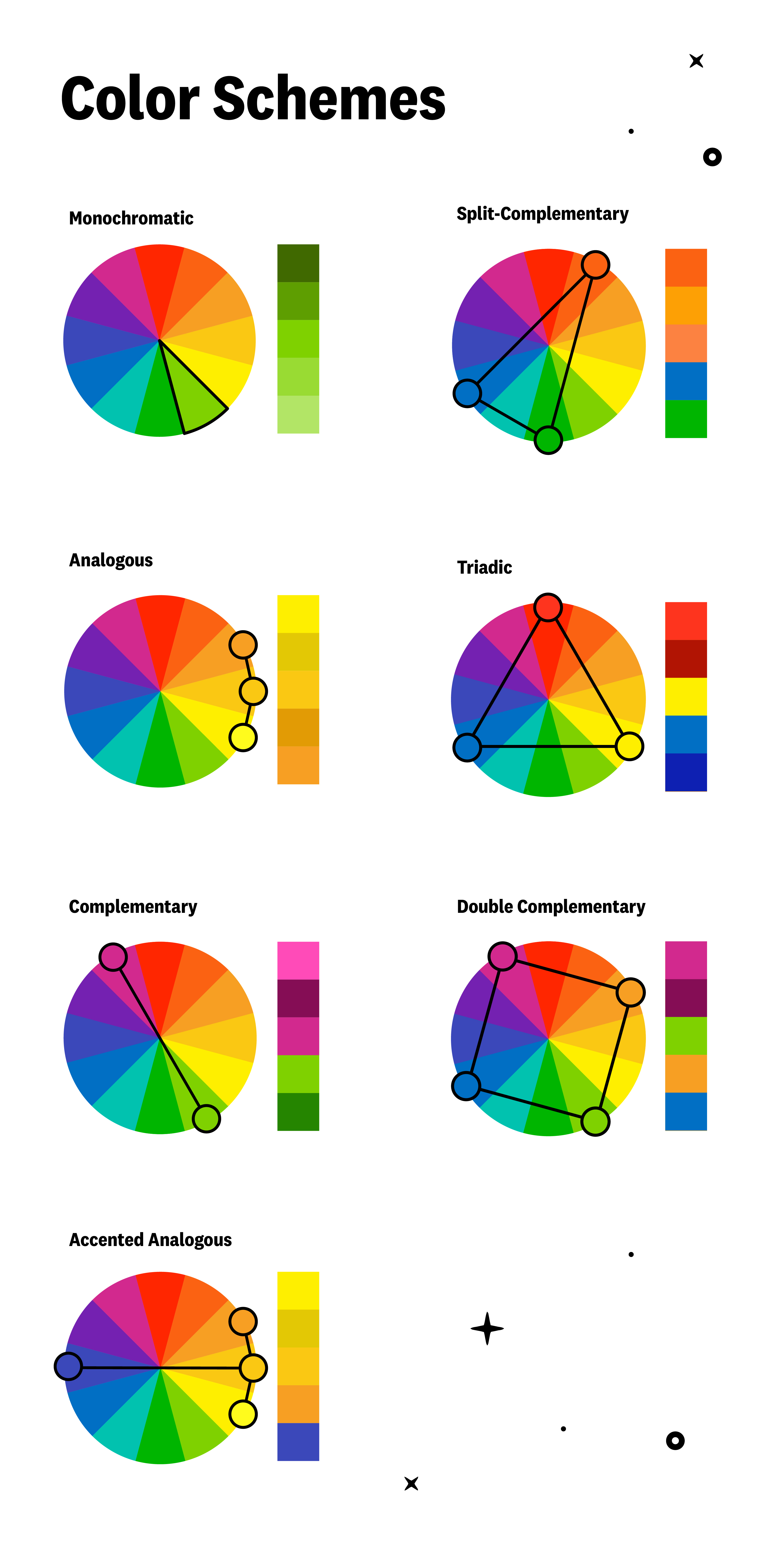
Types of Traditional Color Schemes
There are several predefined color palettes that make creating new schemes easier, especially for beginners. Let’s discuss these traditional schemes with some examples.
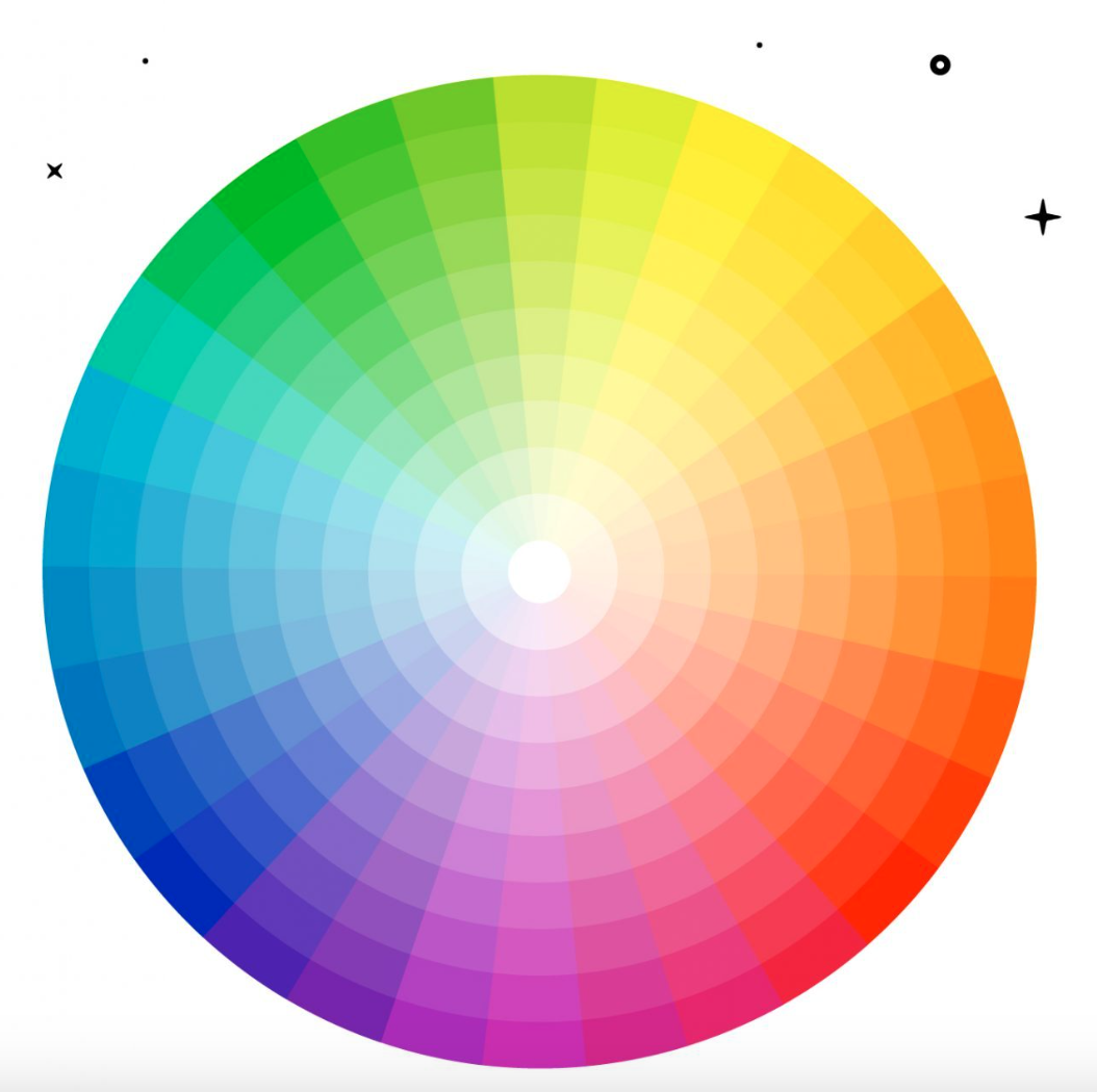
For these palettes, it’s important to always keep the color wheel in mind.
Monochromatic Scheme
Monochromatic color schemes are made up of different variations of a specific hue. These are the simplest color schemes to create, since all the colors are derived from the same tone, making it harder to create a discordant or unattractive combination (though nothing is impossible).
Monochromatic schemes are easy to create, but they can also be a bit dull. Adding a strong neutral like white or black can help keep the scheme visually interesting.

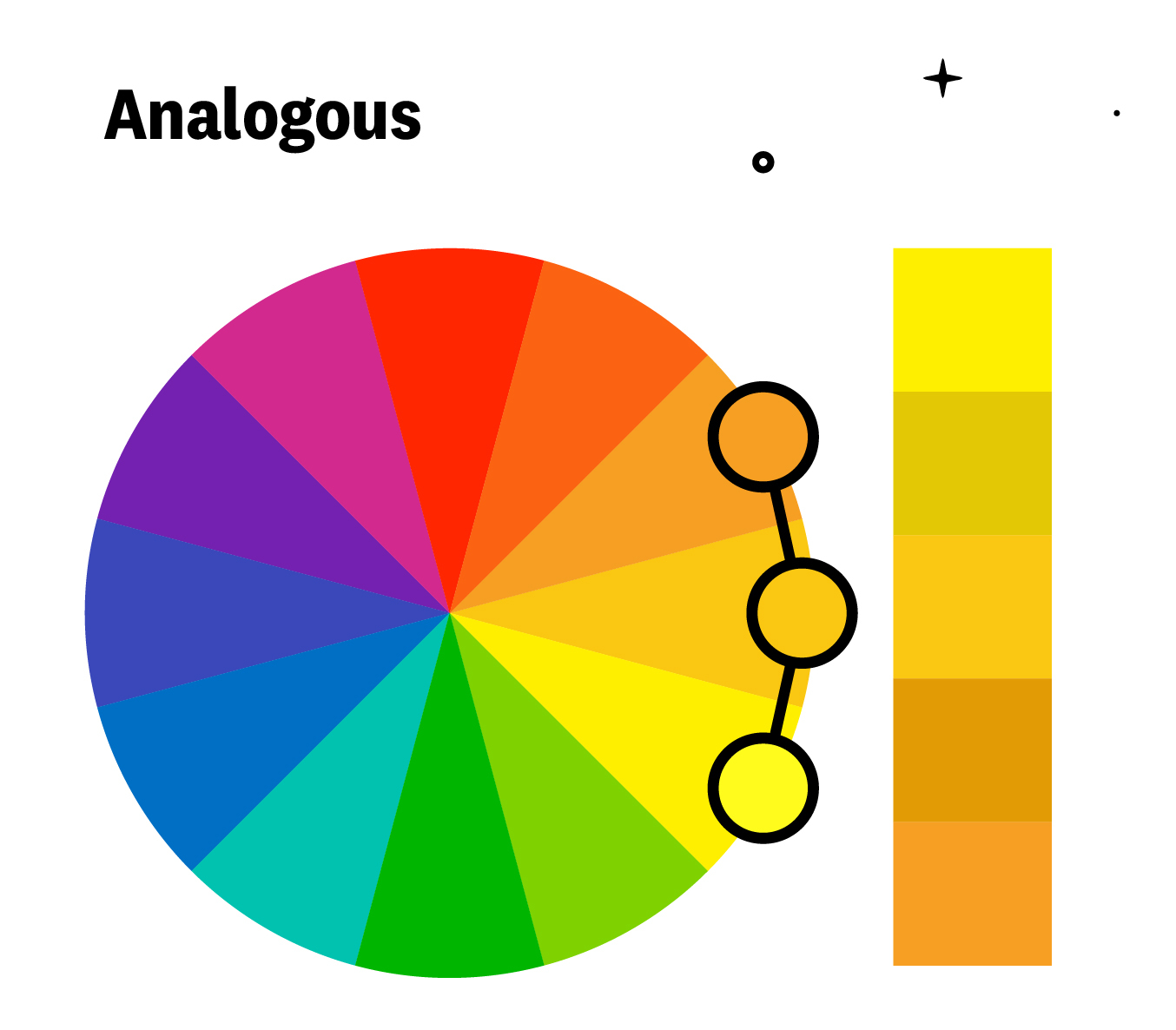
Analogous Scheme
Analogous color schemes are created using colors that are next to each other on the color wheel. Like monochromatic schemes, analogous colors are very balanced but offer more contrast between the colors.
Complementary Scheme
Complementary schemes are created by combining colors that are on opposite sides of the color wheel. In their simplest form, these schemes consist of just two colors but can be easily expanded by varying the properties of the colors.
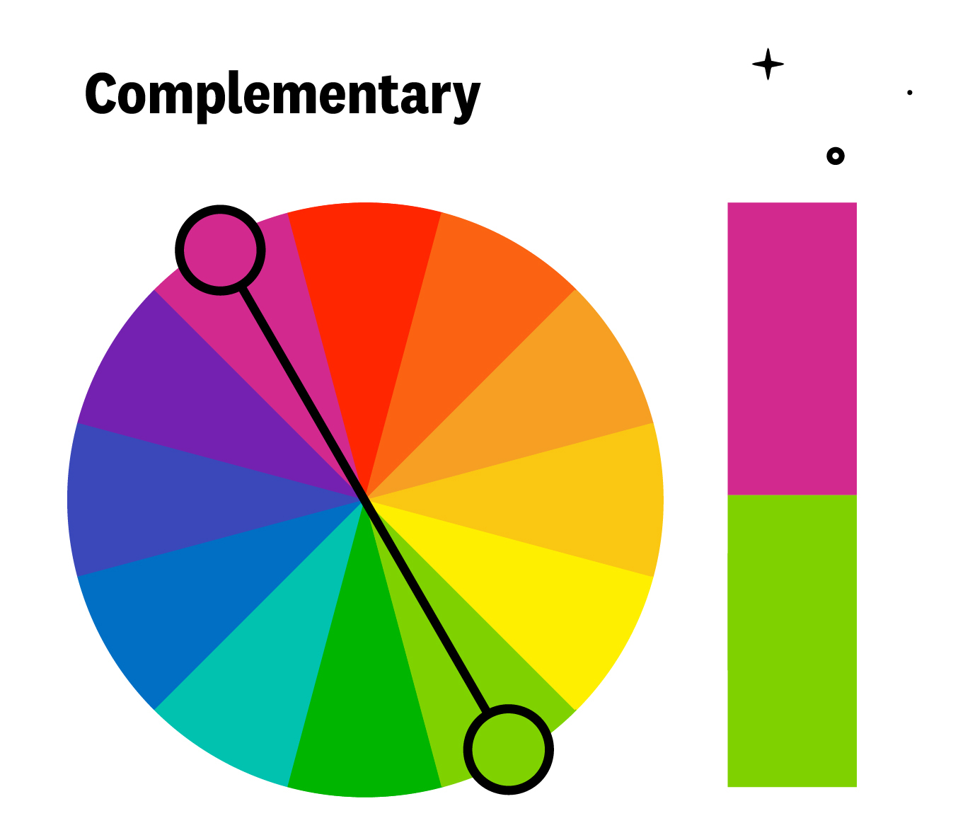
However, using colors that are opposites (with very similar values in terms of lightness and saturation) can be visually discordant and may cause a “vibration” effect along their edges. Therefore, it’s better not to place them directly next to each other; instead, add an intermediate color to serve as a transition.


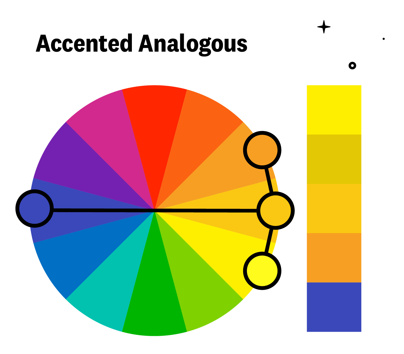
Analogous with Accent Scheme
This scheme results from combining the analogous and complementary schemes. It’s a way to add a point of interest to a scheme that might otherwise be somewhat dull, achieving a harmonious mix of colors with a “pop.”
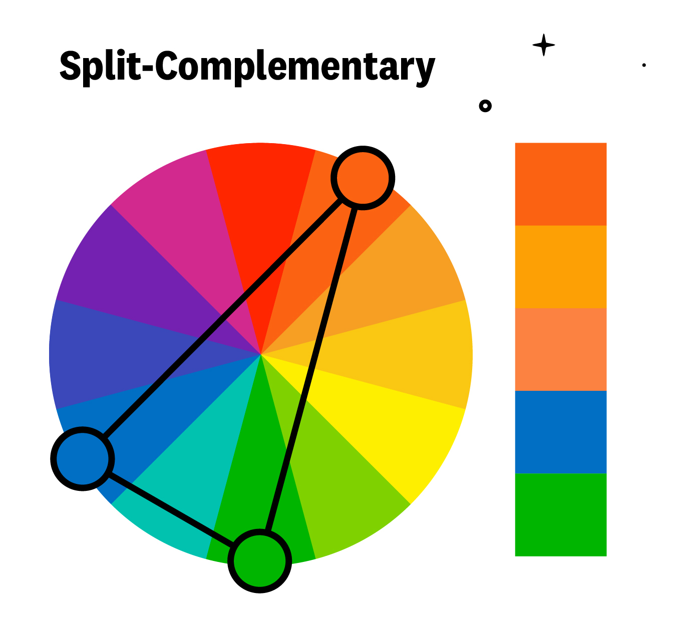
Split-Complementary Scheme
A split-complementary scheme involves a base color and the two colors adjacent to its complementary color. This provides high contrast like the complementary scheme but with less tension.
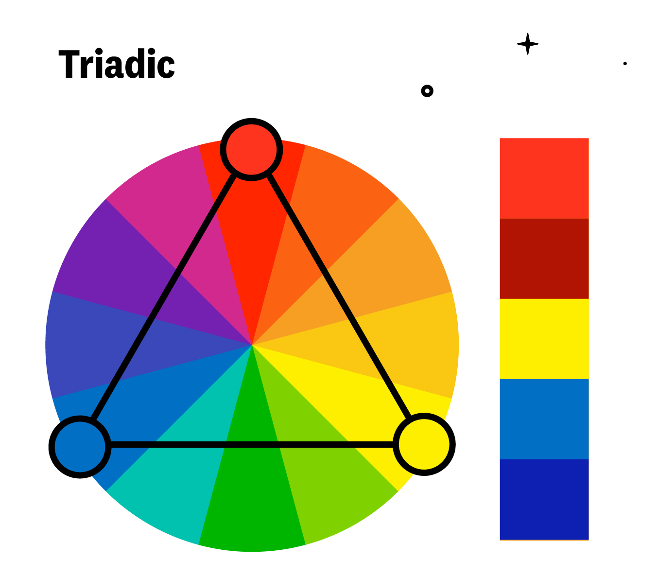
Triadic Scheme
Triadic color schemes are composed of tones evenly spaced around the color wheel, meaning the distance between the colors is the same. This is one of the most diverse color schemes. They can be challenging to execute well but add significant visual interest to a design when done correctly.
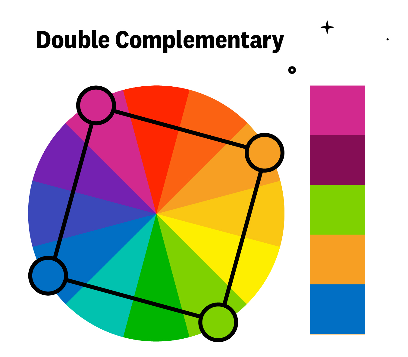
Double Complementary (Tetradic) Scheme
Tetradic color schemes are probably the most challenging to implement effectively. They involve combining pairs of complementary colors. For example, green, red, orange, and blue.
Custom Scheme
Custom color schemes are the most complex to create. Instead of following the predefined color schemes discussed earlier, a custom scheme doesn’t have to be based on any formal rule. For this type of scheme, it’s crucial to consider the concepts of hue, saturation, and lightness.
Some Recommendations for Creating Custom Color Schemes:
- If you already have a defined primary brand color, it’s a good idea to use that as your starting point.
- Don’t forget to include neutral colors (black, white, gray, off-white, brown, beige…).
- It’s important to have a good range of lightness in the scheme—colors that are light enough to work as backgrounds and ensure good readability, as well as colors that are dark enough to be used for text.
- Let your main brand color be the “pop” of color that draws attention to key elements (buttons, keywords, hyperlinks…).
- Start by creating a 5-color palette, and add or remove colors as needed.
- Begin with a predefined traditional color scheme and adjust it. This gives you an initial idea of the direction to take in terms of which colors to consider.
- Highly desaturated colors—those that are close to pure white, gray, or black—combined with a bold accent color are usually a safe and effective bet.
- If you’re feeling stuck, draw inspiration from an image and extract colors from it. You can do this with tools like the Adobe Capture CC mobile app, which also lets you easily import your color palettes into Illustrator or Photoshop.
Useful Resources and Tools
Here’s a list of websites and other tools that can help you get started creating your own color palettes:
- Adobe Color
- “Color Guide” panel in Illustrator
- Coolors (also has Adobe and Figma plugins, a Chrome extension, and an app)
- Color Hunt
- Picular
- Khroma
- Toptal
- Colorbox
- Paletton
- Colorzilla (a Chrome and Firefox extension that lets you grab the color code from anything you see online)
- Canva Color Palette Generator