Use Color Smartly in Your Email Marketing Templates
![]() Rocío Cortázar · 12 Feb, 2026 · Diseño Gráfico · 5 min
Rocío Cortázar · 12 Feb, 2026 · Diseño Gráfico · 5 min

Learning to use color in email marketing consistently and creatively is a great tool to enhance your campaigns and make them more interesting and effective. Our brain processes visual information much faster than text, and color is a key factor when evaluating what we see.
It’s clear that color has power, so today we’re going to see how to take advantage of it in your email marketing templates.
First, I’m going to leave you a few articles from our blog so you can learn everything you need to know about color theory:
1. Organize Your Emails with Color Tabs
You can use small color tabs or labels to improve content organization and help readers quickly scan the email.
Many brands use this technique to organize both text and images. The best part about these color touches is that they are not images, but HTML background colors, ensuring they will always be displayed.
In Acumbamail, you can do this using the underline option in text modules or using the button module (just don’t add any link in the properties column).
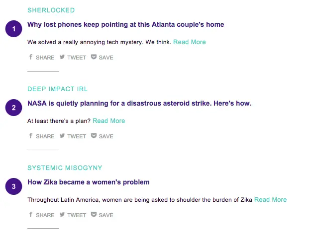
In this example, Robinhood Snacks uses small green text tabs to categorize each story. “Tappy” and “Aww” highlight must-see or adorable content:

These tabs are subtle but help segment the content and provide extra information to readers.
2. Use a Unified Color Palette
You can use the colors from images in headers and call-to-action buttons to create a more cohesive and attractive design. This technique works very well in product emails. You can extract the exact color you want or even create entire palettes from an image with tools like Coolors.co Image Picker.
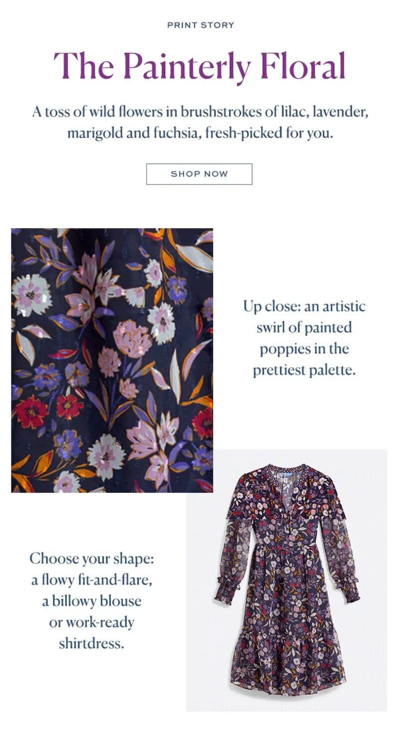
In this example, Draper James uses lilac, lavender, yellow, and fuchsia colors in the text, combining them with the dress being promoted. Thus, the email maintains a harmonious aesthetic.
3. Add Background Color to Your Text Blocks
Mix the images in your email with blocks with HTML background colors. This helps structure the content and give it visual coherence.

Make sure the color blocks are HTML background colors and not images, to improve the text-to-image ratio and optimize accessibility. And don’t forget to make it responsive!
4. Separate Content with Colors
Many emails have a white background, which gives a clean feel and makes it easier to read black text. However, you can play with color to separate and visually organize the content.

Some brands divide the sections of their emails with different background colors, like Maquillalia in this email. This helps readers navigate the content more easily.
5. Play with Color in Text
There’s no rule that says text in an email must be black. As long as there is enough contrast with the background, you can experiment with colors. I recommend always checking the contrast of your background and text to ensure it will be 100% legible. You can do this with the Coolors.co Color Contrast Checker.
For example, Fusion uses a combination of aquamarine and purple for their content lists. This consistent use of colors in headers and subheaders makes the email easier to read and organize.
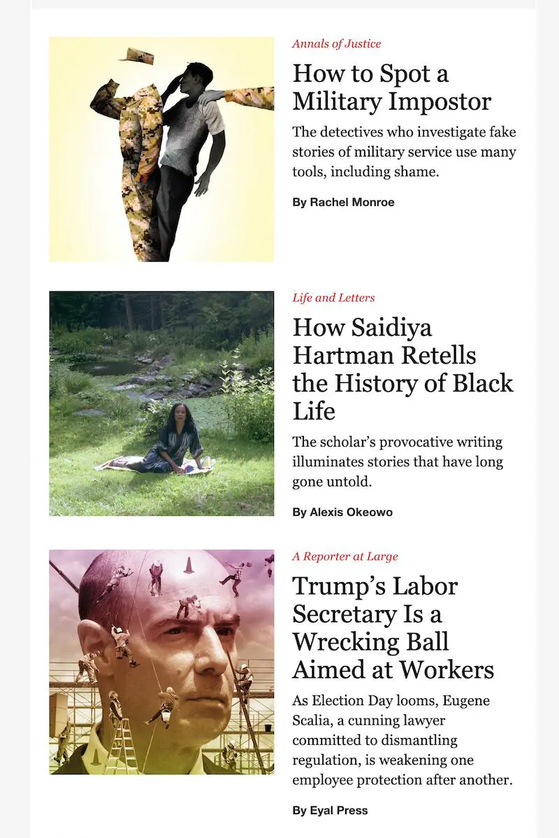
The New Yorker adds small red texts above each headline to categorize articles and capture the reader’s attention.
6. Highlight Your CTAs with Colors
If there’s one place where you should use color wisely, it’s in call-to-actions (CTAs). These should clearly stand out from the rest of the content, allowing readers to identify them immediately.

Ideally, choose a color that fits with the brand’s visual identity and the email design. Many brands, like Cratejoy, use the same color as their logo in their CTA buttons to reinforce their visual identity and improve conversion.
Here are some ideas for your CTA colors:
- 🟢Green on white → conveys security ✅ 🔴Red on white → creates urgency ⏳ 🔵Blue on white → inspires trust 😌 🟠Orange on black → visually stands out 💥
7. Unify the Color of Your Links
There’s no need to resort to the classic bright blue to indicate that a text is a link. You can leverage your brand’s visual identity and use another distinctive color.

For example, Civitatis uses its corporate color to highlight its links.
HTML colors are an excellent organizational tool in emails:
- They display in all email clients (unlike images). They require less code. They are easy to implement.
You can use them to differentiate sections or to highlight the headers and footer of the email.
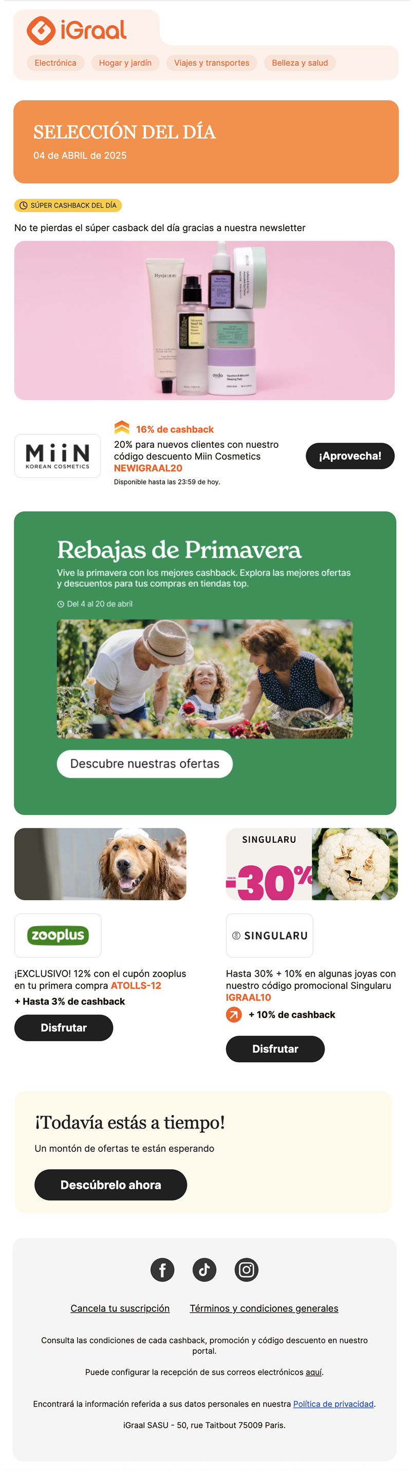
This iGraal newsletter is a great example of how to use background colors to separate content and highlight parts of your email.
9. Dare with Black and White
Another creative way to use color is… not to use it! A black and white email can be an elegant and distinctive alternative.
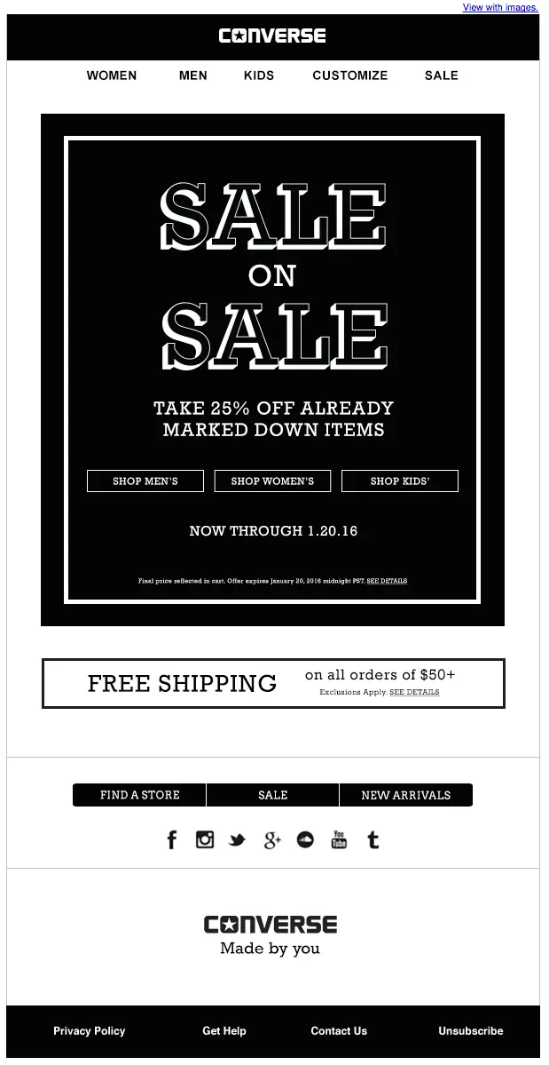
Without color, you’ll need to optimize other aspects of the design, such as the use of white space, typography, and visual hierarchy. Converse has achieved great impact with this minimalist approach in their emails.
As you can see, using color smartly in email marketing can help you achieve more conversions and improve your results. Are you ready to try it?


