Color Theory – Part II – Basic Properties of Color
![]() Rocío Cortázar · 30 May, 2025 · Email Marketing · 3 min
Rocío Cortázar · 30 May, 2025 · Email Marketing · 3 min
In the first part of this series on color theory, we covered the meanings of colors and their cultural implications. In this part, we’ll focus on reviewing the properties of color: the most basic concepts that affect a color.
We’ll try to simplify it as much as possible, as color is much more complex than people usually imagine, and there’s a lot of science behind it.
Properties of Color
In Color Theory, the properties of color are the attributes that change and make each color unique.
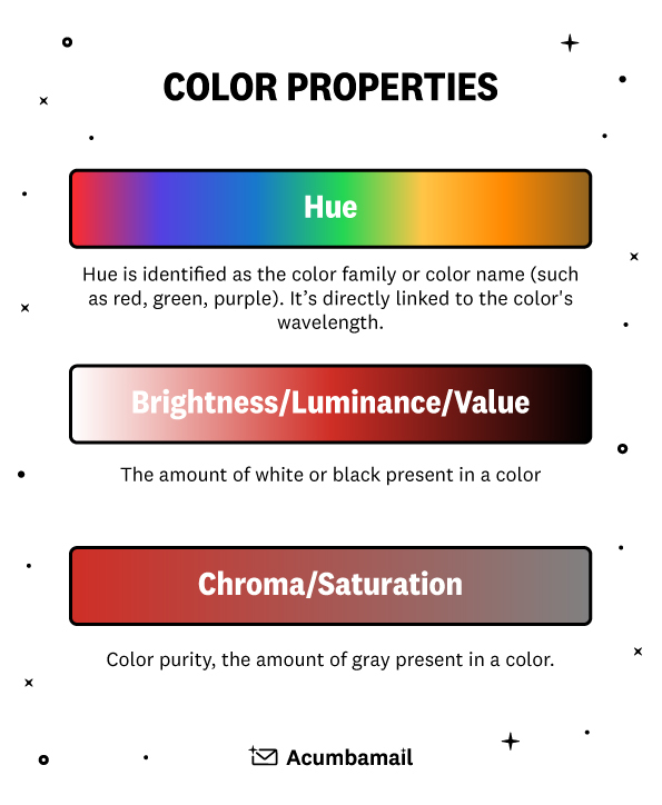
We’ll discuss three main characteristics to distinguish any color:
- Hue
- Saturation
- Lightness
Hue
Hue, also known as tone, tint, chroma, is the most basic property, as it’s used to differentiate one color from another and by which we name it. When we say “blue,” “green,” or “red,” we’re talking about the hue.
It refers to the position of each color within the color wheel and the nuances those colors acquire, such as orange-red or blue-green.

Saturation
Saturation represents the chromatic intensity or purity of a color. In other words, it’s the amount of gray contained in the mixture of a specific color.
The more gray a color contains, the lower its saturation or, in other words, the more desaturated it is, and consequently, it will appear “dirty” or opaque.
Conversely, the less gray present in a color, the higher its saturation or purity.
When mixing two complementary colors, that is, those located on opposite sides of the color wheel (red-green, yellow-purple, blue-orange…), the result obtained would be gray; this is called neutralization.
In design, colors with similar saturation levels make designs appear more cohesive. Colors with similar but not identical saturations can have a discordant effect.

Lightness
Lightness, or value, is the brightness or darkness of a color. That is, the proximity of a specific color to white or black. An example would be calling a hue that is closer to white “light red” or one that is closer to black “dark red.”
We can also consider that lightness is the amount of light a hue has, especially when comparing them with other colors. For example, we can say that yellow is lighter than blue or green is lighter than brown. This is very easy to verify; all you need to do is apply a black and white filter, and you’ll easily see which color has greater lightness.
Combining colors with different values is a good practice, as it adds contrast to the design, resulting in a more aesthetically pleasing design.

In Conclusion…
It’s important to keep these three concepts in mind and understand them when creating cohesive and aesthetically pleasing palettes.
Color offers a vast spectrum of possibilities, and it’s easy to feel overwhelmed by all the options. Narrowing down based on meaning and properties is a good start to at least have some of your options clear.


