What is the Best Color for CTAs in Your Email Marketing Campaigns?
![]() Rocío Cortázar · 12 Feb, 2026 · Diseño Gráfico · 4 min
Rocío Cortázar · 12 Feb, 2026 · Diseño Gráfico · 4 min

When it comes to email marketing campaigns, every element counts. But there is one that stands out above the rest: the call to action (CTA). That button inviting your subscribers to click is undoubtedly the key to converting an open into a specific action.
From signing up for an event to making a purchase or reading an article, the goal of the CTA is to guide the reader to the next step. And one of the most important factors for it to work is the color of the button. But… is there a color that converts better than the rest?
In this article, we will tell you how to choose the best color for your CTA buttons in your email marketing campaigns.
What is a Call to Action (CTA)?
A CTA (Call To Action), or call to action in plain terms, is a clear instruction for the reader to take a specific action: “Download now”, “See more”, “Sign up for free”. It can be in text form, but it usually works much better as a button.
These buttons are essential as they help the reader make a quick decision without having to think too much. In fact, studies show that something as simple as changing the button color can drastically increase conversions.

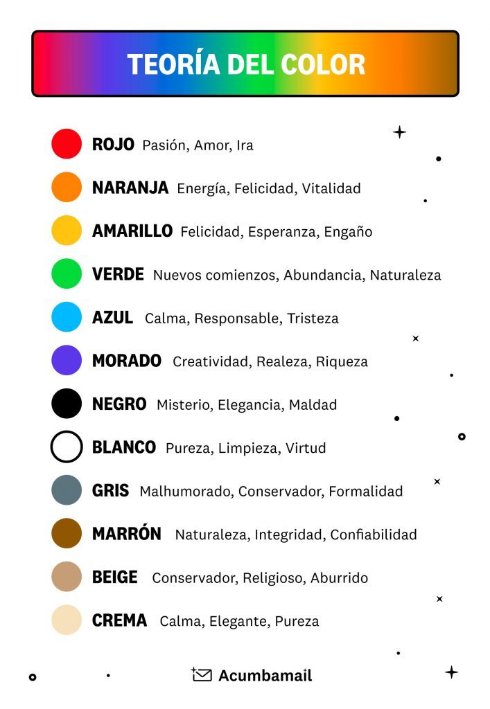
The Psychology of Color: How It Influences Decisions
Color is not just aesthetics: it is also emotion and perception. Our mind associates colors with feelings, values, and experiences. Here is an infographic with different colors and their associations:
But beyond the psychological meaning, you also have to consider whether the chosen color fits your brand’s personality. It’s not about choosing the “best” universal color but the one that best represents your brand and stands out in your design.
Here are all the articles from the blog that we have made with color as the main theme so you can become an expert:
- Color Theory – Part I – The Meanings of Colors
- Color Theory – Part II – Basic Properties of Color
- Color Theory – Part III – Creating Color Schemes
- Use Color Smartly in Your Email Marketing Templates
Best Practices for Choosing Your CTA Color
Here are some recommendations to get the color of your call-to-action buttons right:
1. Use Your Brand Colors
Many companies use colors from their logo or corporate palette for their CTAs. This creates visual consistency and reinforces branding. For example, Nintendo uses the red from its logo in both the header and the call-to-action button, achieving a harmonious and recognizable design.

2. Maintain Consistency Across All Your Emails
If each CTA has a different color, you can confuse the reader. Ideally, you should use one color for your main CTAs and another for the secondary ones, and maintain them throughout all your campaigns. This way, the user will automatically associate that color with an action they can take.
3. Prioritize the Main CTA
Not all buttons carry the same weight. If your email has multiple links, ensure that the main button stands out more than the others. How? With a more striking color, larger size, and a strategic location within the content. Here is an example of how Amazon Prime does it in their newsletters, highlighting the main CTA with a more contrasting color.

4. Make the Button Stand Out
A good CTA button should stand out from the rest of the design. Do not use colors that blend with the background or the rest of the content. Look for high contrast: a red button on a white background, or a dark blue one on a light background.
Here is a tool to check that your contrast between colors is at an optimal level:
You can also apply an isolation effect, leaving white space around the button. This way, the button draws much more attention from the reader.
5. Vary the Color Within Your Palette
If your brand has several corporate colors, you can play with them depending on the type of email or message. This strategy works well if you have a clear and well-defined style guide.
What is the Best CTA Color?
The short answer: it depends. There is no magic formula, as each audience responds differently. Therefore, the key is to test, measure, and adjust. To reach your ideal CTA, you can:
Conduct A/B Tests
Create two versions of the same email, changing only the CTA button color. Send each version to a similar sample of your audience and analyze the results. Repeat the process several times with different colors until you find the one that converts best.
Ask for Feedback
Another option is to include a brief survey or form in your emails to get your subscribers’ opinions on the design. Sometimes, a simple “Was this button clear to you?” can give you valuable insights.
Conclusion
The color of your CTA buttons in email marketing can make the difference between a conversion and a lost click. It’s not just about aesthetics: it’s about guiding attention, conveying emotions, and facilitating the action.
Try different colors, measure the results, and maintain visual consistency with your brand. This way, you’ll achieve more effective campaigns and a higher return on your sends.
At Acumbamail, you can create CTA buttons without needing to code anything. Its visual editor allows you to easily test different colors, sizes, and locations, always maintaining consistency with your visual identity. Plus, you can get inspired by our template catalog to see how calls to action have been implemented.


