This is what you need to know about the European Accessibility Act and what to review in your email campaigns
 Lucía Pérez · 07 Oct, 2026 · Marketing Online · 6 min
Imagine an online store sends an email with an offer. The deadline is within an image, the button only says “Click here,” and the price appears in gray letters on an almost white background.
When someone receives that campaign, it’s very likely they won’t be able to know the promotion’s conditions or complete the purchase.
You might think it’s a very exaggerated case, but I’ve encountered emails like that.
The problem is not whether the email is more or less beautiful, it’s that part of the information is not available to everyone.
From June 28, 2025, the requirements of Law 11/2023, which incorporate the European Directive 2019/882, known as the European Accessibility Act or EAA, apply in Spain.
This regulation applies to certain products and services, including e-commerce services. If you’re here, it’s because you’re at least minimally interested in the topic, so… What does this mean for your email campaigns?
Let’s explain it in detail so you have no doubts.
Does the EAA require all emails to be accessible?
There is no rule in Law 11/2023 that states that all newsletters and all marketing emails, from any company, must pass a specific email checklist. Claiming so would go beyond the legal text.
The law defines e-commerce services as those provided remotely by electronic means, through websites or mobile services, at the individual request of a consumer and with the aim of concluding a contract. If your business sells only to companies, this service is outside the scope of the regulation.
It also establishes accessibility requirements for the information and functions of the services included in its scope.
Therefore, if you sell online, it’s advisable to review the entire journey:
- The email explaining the offer
- The landing page it leads to
- The form
- The payment process
Making the email button readable doesn’t fix an inaccessible purchase page. And if the essential conditions of an offer are only in an image in the email, you’ve already created a barrier before the person reaches the website.
The law exempts microenterprises providing services from these requirements.
When we talk about microenterprise in this context, it means they have fewer than ten employees and an annual turnover or total annual balance not exceeding two million euros.
Having said all this, one thing must be kept in mind: the legal exemption does not prevent applying the improvements in this guide.
The urgency, therefore, is real for the services covered by the regulation. Email accessibility should be evaluated within that service, without confusing a technical recommendation for campaigns with a literal obligation applicable to any send.
Accessibility checklist for your emails
With the scope of the law clearer, it’s time to look at a specific campaign. Some barriers are easy to overlook: an offer that only appears within an image, text that barely stands out from the background, or a button that doesn’t explain where it leads.
It may also happen that the email is perfectly understood, but the person encounters the problem when opening the form or trying to pay.
The following seven points will help you review the content, readability, navigation, and what happens after the click.
Let’s go with a practical case. Take a recent email and check the following:
1. Is it understandable even if images don’t load?
Disable images and read the email. Do the product, price, conditions, date, and call to action still appear? If you’ve turned the entire message into a single creative, you’ll need to transfer that information to the email text.
Images can support the content. They shouldn’t be the only place where the necessary information to understand an offer lives. Here’s an article with a more extensive explanation on why to avoid emails composed solely of images.
2. Does the alt text explain the function of each image?
The alt text (attribute “alt”) helps interpret an image when it’s not visible or a screen reader is used. Write what the person needs to know, according to the function of that image in the email.
- If an image contains the text “20% discount until Sunday,” that information must also appear as real text.
- If an image is purely decorative, it can have an empty alt (alt=””).
- If the image functions as a link, the alt text should indicate where it leads or what action it performs.
3. Can the text be read easily?
Check the contrast of the text and buttons against their background. As a technical reference, the WCAG guidelines establish a minimum ratio of 4.5:1 for normal text and 3:1 for large text.
Don’t rely solely on how it looks on your screen: measure the colors with a contrast checker. You can search for one on Google; they are usually free and very simple to use.
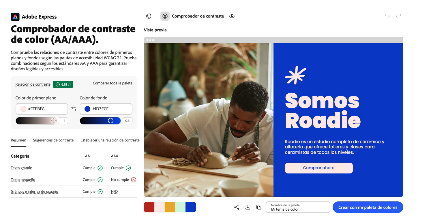
Use a comfortable font size, leave space between lines, and avoid blocking text enlargement. There is no universal pixel size that, by itself, makes an email accessible. A minimum of 16 px is often recommended.
The useful test is to enlarge the content and check if it can still be read without words or buttons disappearing.
4. Does the structure make sense when read in order?
Separate the content into brief blocks, use descriptive titles, and put the information that allows a decision to be made first.
In an HTML template, use headers and paragraphs with semantic meaning whenever the editor and email clients allow it.
Do a simple test: read the email from top to bottom without paying attention to size, color, or position of elements. Is the offer understood? The visual order and reading order should tell the same story.
5. Do the links and buttons say what will happen?
“Buy the course,” “Check the conditions,” or “Download the guide” explain the action. “Click here” or five buttons with the text “See more” require searching for context.
Avoid distinguishing a link solely by color (here we discuss the best color for CTAs). Also, check that buttons have readable text and enough space to be comfortably clicked from a mobile device.
I recommend reading this article to write good calls to action.
6. Can you navigate the email with a keyboard and screen reader?
Send yourself a test and move through the links with the Tab key. See if the focus follows a logical order and if each action can be reached. Then listen to the message with a screen reader available on your device.
This test often reveals issues that a preview doesn’t: links without a clear name, images announced without context, or blocks read in an unexpected order.
Tip: repeat the check in the email clients most used by your audience, as the display and HTML support may vary.
7. Does the landing page maintain accessibility?
The work doesn’t end when the button is clicked. Review the form, error messages, offer conditions, and payment. If someone can read your email but can’t complete the next step, the previous work is useless.
And what about dark mode?
Dark mode changes how colors are displayed in some email clients. It deserves a display test, but it doesn’t equate to an accessibility audit.
A message can look good in dark mode and still have images without alt text, ambiguous links, or an incorrect reading order.
If you want to review that aspect in your emails, also check how to adapt your emails to dark mode.
At this point, I recommend this accessible design guide for emails so you can delve into the visual composition of your campaigns.
Start with a template and a real journey
You don’t need to review all your old sends in one afternoon. Select the template you use the most and an email that leads to a purchase or registration. Check the message without images, measure the contrast, navigate its links with a keyboard, and finish the process on the landing page.
Note each improvement point detected, determine who can correct it, and in which template it appears. Thus, an improvement in the template also benefits future sends.
The European Accessibility Act is already in effect for the services it covers. The first practical step is to check if your service falls within that scope and locate where information is lost or an action is interrupted. Your emails are part of that journey.
Put it into practice with Acumbamail. Open one of your templates in the editor, review the text and images, check its preview on different devices, and send yourself a test before launching the campaign. You can create or adapt your email template with Acumbamail and use this checklist to detect barriers that the editor cannot automatically resolve.
However, the tool facilitates testing, but it doesn’t certify compliance with the law or the accessibility of the landing page by itself.