Color Theory – Part I – The Meanings of Colors
![]() Rocío Cortázar · 12 Feb, 2026 · Diseño Gráfico · 8 min
Rocío Cortázar · 12 Feb, 2026 · Diseño Gráfico · 8 min

There are few things in design that are more subjective and at the same time more important than the use of color. A color can provoke a reaction in one person and at the same time provoke the opposite reaction in another. There are many reasons for this: cultural factors, biases, prior association, or even just personal preference.
Color theory is a science and an art in itself, upon which some have built entire careers, such as color consultants or brand consultants. Knowing the effects that color has on most people is a valuable skill that will help you enhance your message if used correctly.
However, it’s quite complex. Something as simple as slightly changing the hue or saturation of a color can evoke completely different sensations. This factor can be further exacerbated by cultural differences; a color that may be associated with happiness in the West can become depressing in the East, or vice versa.
This will be the first part of a 3-part series in which we will discuss the meanings behind different colors. In Part 2, we will talk about how hue, chroma, value, saturation, tones, tints, and shades affect how we perceive colors. And in Part 3, we will discuss how to create effective color palettes for your designs.
Remember that, in addition to color theory, there are other graphic design tricks for non-designers that we have already shared on this blog.
Warm Colors

Warm colors include red, orange, yellow, and variations of these three colors. They are the colors of fire, autumn leaves, and sunsets and sunrises, and are generally energizing, passionate, and positive.
Red and yellow are primary colors, and their mixture results in orange (making it a secondary color). This means that warm colors are 100% warm, that is, they are only obtained by mixing two other warm colors, not by combining a warm color with a cool color. Although we can bring a cool color to a warmer spectrum by adding warm colors to the mix. For example, if we add a lot of yellow to a green, that green will be closer to yellow than to blue, so we can give it more characteristics of a warm color even if it is not.
Use warm colors in your designs to reflect passion, happiness, enthusiasm, and energy.
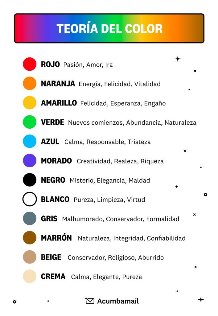
Red
Red is a very warm color, and it is also the color with the greatest presence in the visible light spectrum, making it a very dominant color that easily prevails over others.
It is associated with fire, violence, and war. But it is also associated with love and passion. Historically, it has been associated with both the Devil and Cupid. Red can have a physical effect on people, raising blood pressure and heart and respiratory rates. It has also been shown to enhance human metabolism.
Color theory states that red can be associated with anger, but it is also associated with important events (red carpet at award ceremonies and celebrity events). Red also indicates danger (hence traffic lights, stop signs, and often warning labels are red).
Outside the Western world, red has different associations. For example, in China, red is the color of prosperity, abundance, and happiness. It can also be used to attract good luck. In other Eastern cultures, brides wear red on their wedding day. While in South Africa, red is the color of mourning. Red is also associated with communism.
In design, red can be a powerful accent color. It can have an overwhelming effect if used too much, especially in its purest form, so it should be used with caution. It is a good choice when power or passion wants to be portrayed. Red can also be versatile, while brighter versions are more energetic, darker shades can convey power and elegance.
Orange
Orange is a very vibrant and energetic color. When presented in a more muted manner, color theory says it can be associated with the earth and autumn, as it resembles brown. Due to its association with changing seasons, orange can represent change and movement in general. Orange is also strongly associated with creativity.
Because orange is associated with the fruit of the same name, it can be associated with health, vitality, and freshness. In designs, orange grabs attention without being as overwhelming as red. It is often considered more friendly and welcoming, and less direct.
Yellow
Yellow is often considered the most bright and energizing of the warm colors. It is associated with happiness and the sun. However, yellow can also be associated with deception, cowardice, or illness.
Yellow is also associated with danger, just like red.
In some countries, yellow has very different connotations. In Egypt, for example, yellow is for mourning. In Japan, it represents courage, and in India, it is a color for merchants.
In design, yellow can provide a sense of happiness and joy. Softer yellows are used as a gender-neutral color for babies and young children (instead of blue or pink). Light yellows also give a calmer sense of happiness than bright yellows. Dark yellows and golden yellows can convey a sense of antiquity, and using them in designs can give a sense of permanence.
Cool Colors
Cool colors, such as green, blue, and purple, tend to be more subdued than warm colors. They are the colors of night, water, nature, and are often calming, relaxing, and somewhat reserved.
Blue is the only primary color within the cool spectrum, meaning the other colors are created by combining blue with a warm color (yellow for green and red for purple).
Due to this, according to color theory, green acquires some of the attributes of yellow, and purple acquires some of the attributes of red. Use cool colors in your designs to give a sense of calm or professionalism.
Green
Green can represent new beginnings and growth. It also means renewal and abundance (the color of dollars). At the same time, green can represent envy or jealousy, and lack of experience.
Green has many of the same calming attributes as blue, but it also incorporates some of the energy of yellow. In design, green can have a balancing and harmonizing effect.
It is appropriate for designs related to wealth, stability, renewal, and nature. Brighter greens are more energizing and vibrant, while olive greens are more representative of the natural world. Dark greens are the most stable and representative of wealth.
Blue
Blue is often associated with sadness in English-speaking countries, as “to be blue” means “to be sad, depressed…”. Blue is also widely used to represent calm and responsibility. Light blues can be refreshing and friendly. However, color theory states that dark blues are stronger and more reliable. Blue is also associated with peace and has spiritual and religious connotations in many cultures and traditions (for example, the Virgin Mary is often depicted in blue robes).
The meaning of blue is greatly affected by the exact tone and shade. Light blues convey relaxation and calm. Bright blues can be energizing and refreshing. Dark blues, like navy blue, are excellent for corporate sites or designs where reliability is important.
Purple
In ancient times, the dyes used to create purple tones were extracted from snails, which was extremely expensive, as it took 10,000 mollusks to obtain even 1 gram of dry dye. Therefore, only royalty and the very wealthy could afford to wear this color, and some Roman emperors legislated so that only powerful people could wear it.
Purple is a combination of red and blue, so it acquires some attributes of both. It is also associated with creativity and imagination.
In Thailand, purple is the color of mourning for widows.
In graphic design, dark purples can give a sense of wealth and luxury. Lilacs are softer and associated with spring and romance.
Neutral Colors

According to color theory, neutral colors often lack prominence in designs, serving as a backdrop. They are usually paired with brighter and more striking accent colors that capture and redirect attention. But if used as protagonists, we can create sophisticated and natural designs. The perception of neutral colors is much more affected by the colors surrounding them than other colors.
Black
Black is the most penetrating and intense of the neutral colors. On one hand, it is commonly associated with power, elegance, and formality. On the other hand, it can be associated with evil, death, and mystery. Black is the traditional color of mourning in many Western countries. It is also associated with rebellion in some cultures and is also associated with Halloween and the occult.
It can be conservative or modern, traditional or unconventional, depending on the colors with which it is combined. In design, black is commonly used for typography and other functional parts due to its neutrality. Black can convey a sense of sophistication, elegance, and mystery in a design.
White
Opposite to black within the spectrum, but like it, it can work well with almost any other color. White is often associated with purity, cleanliness, and virtue. In the West, brides often wear white on their wedding day. It is also associated with the health industry, especially with doctors, nurses, and dentists. White is associated with goodness, and angels are often depicted in white.
However, in much of the East, white is associated with death and mourning. In India, it is traditionally the only color widows can wear.
In design, white is generally considered a neutral background that allows other colors in a design to have a larger voice. However, it can help convey cleanliness and simplicity, and is popular in minimalist designs. White in designs can also represent winter or summer, depending on other design motifs and colors surrounding it.
Gray
Gray is a neutral color, the closest to cool colors, which is why it is sometimes attributed characteristics of this group of colors, sometimes considering it a moody or depressing color. Light grays are often used instead of white in some designs, and dark grays instead of black.
Gray is generally conservative and formal, but it can also be modern. It is commonly used in corporate designs, where formality and professionalism are key. It can be a very sophisticated color. Pure grays are shades of pure black, although other grays may have blue or brown/yellow tones mixed in, bringing them closer to cool or warm colors, respectively.
Brown
Brown is associated with earth and wood. It is a completely natural color and a neutral, which unlike gray, tends toward the warm spectrum. Brown can be associated with security and reliability, with constancy and with the earth. It can also be considered boring.
In design, brown is commonly used as a background color. It helps bring a sense of warmth and integrity to designs. Sometimes it is used in its darker forms as a replacement for black, either in backgrounds or typography.
Beige
Beige is another neutral color that can appear cooler or warmer depending on the color that accompanies it. It has the warmth of brown, so like it, it can sometimes seem dull. It is a conservative color in most cases and is generally reserved for backgrounds, sometimes accompanied by a paper texture.
As it tends to take on the characteristics of the colors surrounding it, it has little effect on the overall impression a complete design gives.
Cream, Off-White
Cream is a sophisticated color, with a touch of warmth from brown and much of the freshness and purity of white. It is a soft color and can often add a historical and classic factor.
In design, this color can give a sense of elegance and calm. When combined with earth tones like peach or brown, it can acquire that earthy quality. It can also be used to lighten darker colors without the stark contrast of using white.
Summarizing Color Theory
Although all this information can be a bit overwhelming, color theory is more about the feeling a particular tone evokes than anything else.
Here is an infographic for you to consult with all the common meanings of the colors discussed.