9 Email Design Trends in 2026
![]() Alicia Zunzunegui · 12 Feb, 2026 · Diseño Gráfico · 5 min
Alicia Zunzunegui · 12 Feb, 2026 · Diseño Gráfico · 5 min

Email marketers face a variety of challenges when creating emails for marketing campaigns.
It is important for emails to be accessible, visually appealing, compatible with all devices, and effective. In other words, they should fulfill the purpose for which they were designed. In this article, we will explore different email design trends for 2026 with examples to inspire you in designing your newsletters.
In 2026, we will see a greater emphasis on graphics and visual aspects. Bold colors, product prominence, and animations. It’s the year to stand out in the inbox, are you ready to achieve it?
Let’s get started!
Striking Headlines
We see the predominance of titles with bold fonts and larger sizes than usual.
The power of copywriting to grab attention is very important in this case. Remember that the headline is the first thing that catches the eye when opening the email. Therefore, you must choose the most precise words to persuade and capture the reader’s attention.
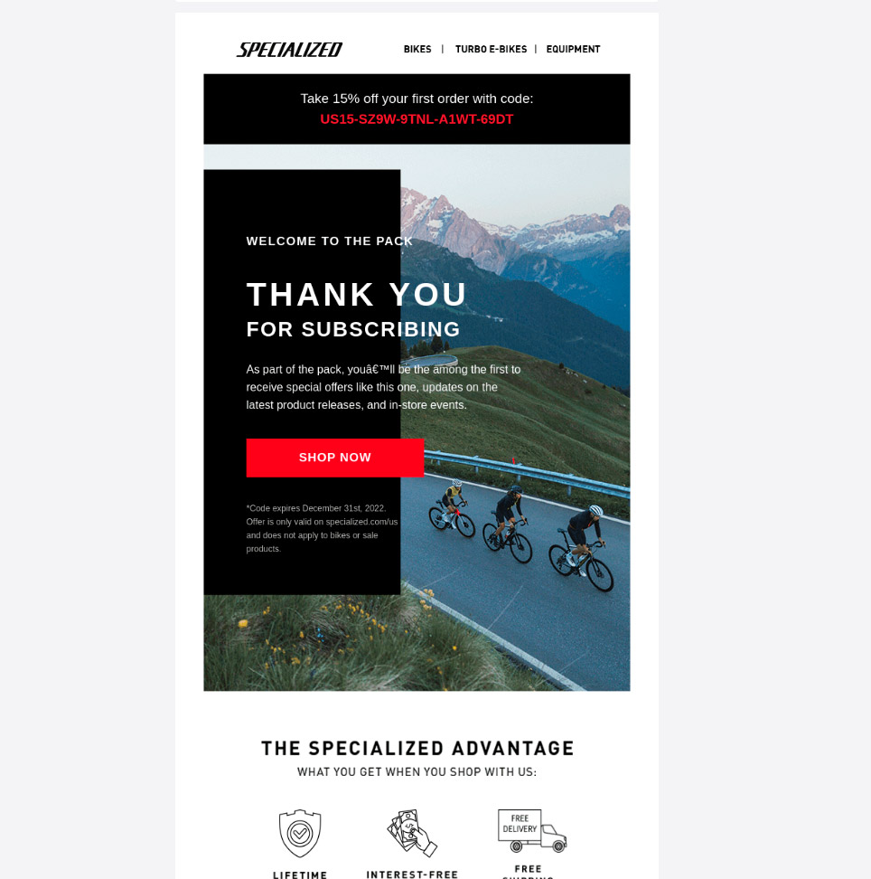
Text Overlaid on Images
Images take center stage among the trends of 2026. However, more than just embedded images, we observe their editing to achieve a more striking effect.
For this reason, try overlaying text on the images you use in your email marketing campaigns.
Check out this example from the brand Specialized.
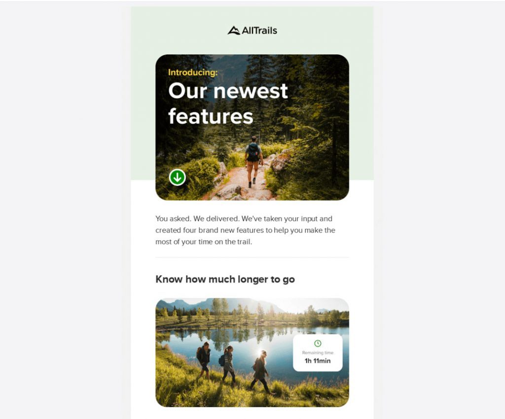
Images with Rounded Borders
Along with the use of text overlaid on images, we also observe masks with rounded borders applied to images.
It creates a more elegant and cohesive style to integrate the visual elements.
In the example from AllTrails, you can see what I mean.
Tables with Outlined Borders
Highlighting the borders of email content is also trending. It’s interesting how this is becoming popular, and some brands are embracing it.
Personally, I think it’s a decision related to the visual style of each brand and the overall content of the email.
Borders attract a lot of attention, and if you overload the email with images and bold text, it can create a “fatigue” effect. As always, balance is key.
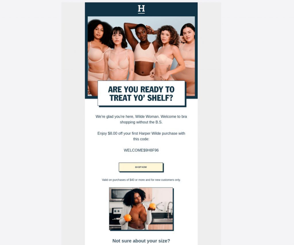
Brightly Colored Backgrounds
Bright and attractive colors will create a positive emotion in readers. So, dare to bathe your emails in readable colors that contrast well and generate a “good vibe.”
They will create a more immersive reading experience, and as a result, you’ll keep the reader engaged with the content for longer.
It’s important to consider your email’s style guide to maintain your brand’s visual identity.
Colored Shadows to Stand Out
The use of shadows is also a visual resource that will play a significant role among email design trends in 2026.
Shadows highlight the elements they are applied to. The use of parallel shadows is a design element used on the web that simulates the effect of a real button.
That’s why it’s interesting to place them on call-to-action buttons instead of using the typical flat button.
The trend is to use patterns and secondary colors to give that “tactile” effect that invites clicking on the button.
Check out the email example below.
Irregular Shapes and Masks
Without a doubt, this trend is a groundbreaking, fun, and youthful approach.
We are used to images in rectangular format or with rounded borders (as mentioned above). However, playing with irregular masks and bright colors gives a casual air to the email and attracts much more attention.
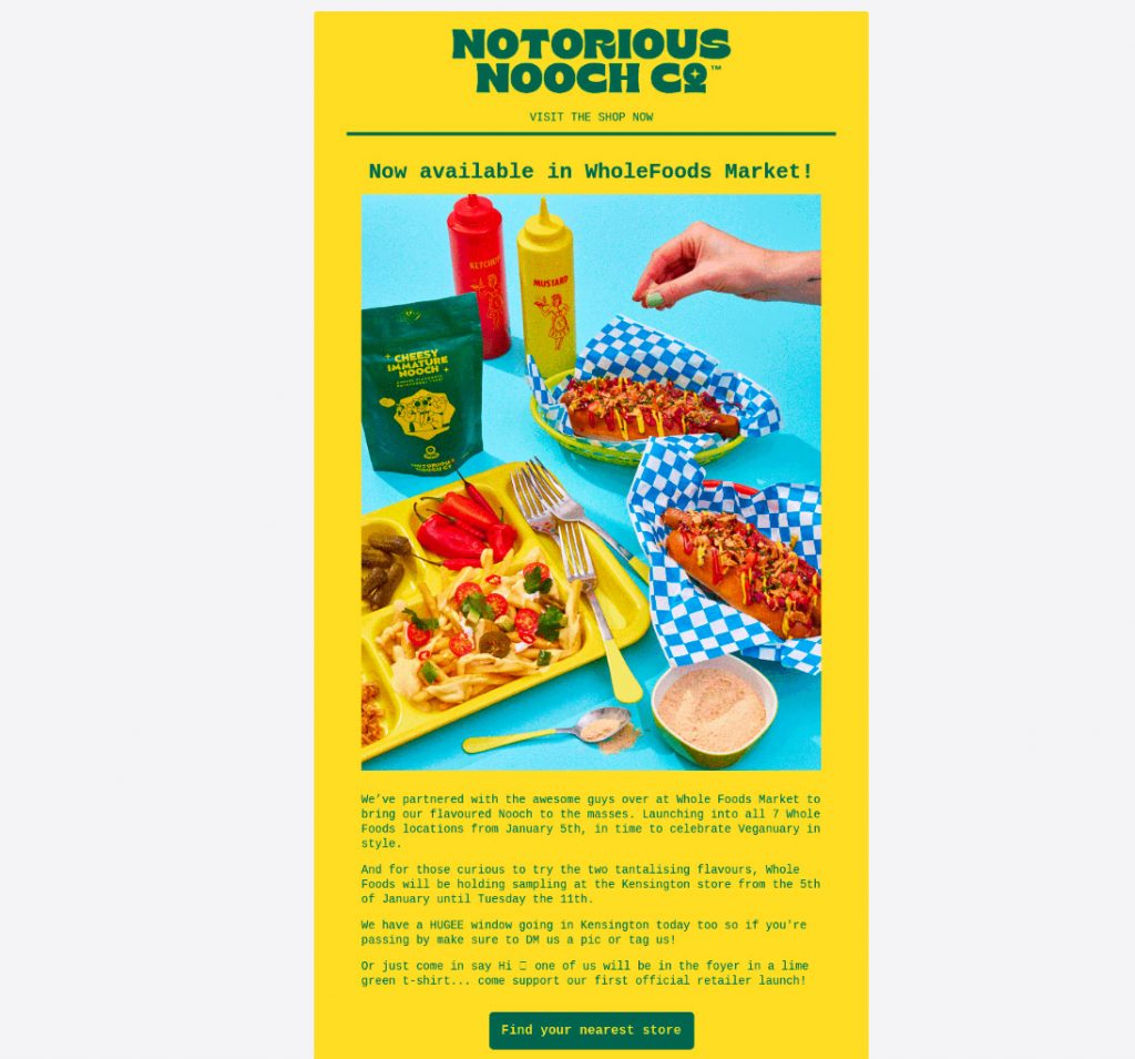
Floating Product Images
If you sell physical products through your email campaigns, I invite you to try this trend. To give more prominence to your products, use the product image in isolation, as if floating.
This way, it stands out from the rest of the message, and appearing alone creates more of a three-dimensional realism that motivates the user to “touch” it (and therefore buy it).
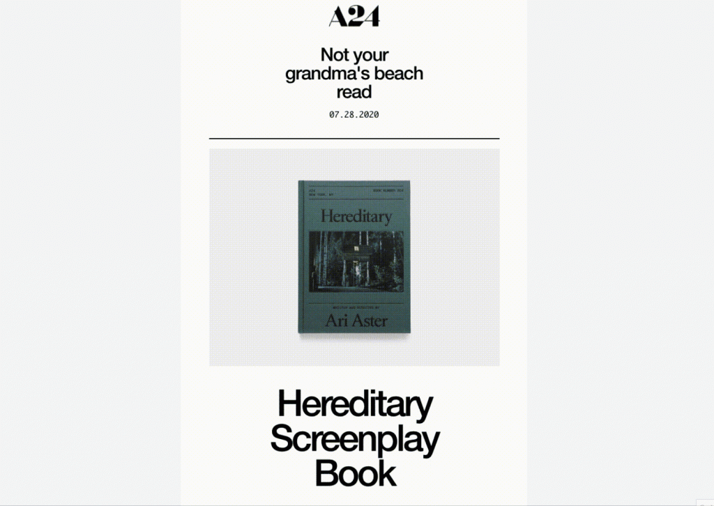
Animated Product Images
The next level to give prominence to products is to animate them. Display them dynamically to create a greater sense of realism, as if you were seeing them in a store window, but the window is the email.
Avoid including very heavy animations to prevent falling into spam and ensure the email loads well in clients. However, the trend is to show product animations as if made in stop motion. This allows more time to observe it and for the mind to generate the desire to acquire it.
Check out the example from A24 below:
I recommend you take a look at this article where we discuss best practices for including animated GIFs in emails.
Conclusions: Email design trends are great but in moderation
After reviewing these 9 email design trends, it’s important to remember that “trends are trends.” As email marketers or people in charge of email campaigns, we must know what’s trending and test how it works.
However, we cannot sacrifice visual identity or compromise the style and message we want to convey just to ride the wave.
Imagine applying all of this in one email 👀 It’s very likely to grab a lot of attention but not fulfill the goal you set out to achieve. Therefore, I invite you to select a couple of trends and include them in your upcoming campaigns to give a fresh air and measure their impact.


