Emails with Images Only: Why They Don’t Work (and What to Do Instead)
![]() Rocío Cortázar · 12 Feb, 2026 · Diseño Gráfico · 6 min
Rocío Cortázar · 12 Feb, 2026 · Diseño Gráfico · 6 min
In the world of email marketing, the visual aspect is crucial for capturing the attention of your subscribers. However, there is a common practice that many brands still employ (just take a look at your Promotions tab to see it’s true) which, far from improving results, can seriously harm them: sending emails composed solely of images.
Although the temptation to use only images for aesthetic reasons is very strong, emails with images only present several problems that negatively affect the deliverability, accessibility, and effectiveness of your campaigns. In this article, we explain the most common mistakes of emails composed solely of images and why this practice doesn’t work, and what alternatives you can apply to improve your results.
What are emails composed solely of images?
We refer to emails with images only as those emails where all the content (text, buttons, links, calls to action…) is completely embedded within one or more images. That is, all the content visible to the user is in graphic format, not in plain text or HTML.
This technique is mainly used for design reasons: it allows greater visual control of the layout, fonts, and styles, especially when aiming to be 100% faithful to a brand’s branding. However, this apparent advantage brings with it a series of technical and functional drawbacks.
Why don’t emails with images only work?
Low deliverability
The spam filters of many email providers (Gmail, Outlook, Yahoo, etc.) consider emails with little or no readable text as suspicious. This is because spammers often hide content in images to avoid detection.
Therefore, emails composed only of images have a much higher likelihood of being marked as spam. As a result, your emails may end up in the spam or promotions folder, significantly reducing your deliverability rate.
👉 Tip: to avoid compromising deliverability, seek a good balance between image and text. A good starting point would be 60% text (remember to reach at least about 400 characters) and 40% image.
Accessibility issues
If you don’t include real text in your email, you create accessibility issues. An email with images only cannot be interpreted by screen readers, making them rely on alternative text (ALT) to understand the visual content. And let’s be honest, what percentage of people fill in the alternative text? As a result, visually impaired people will not be able to access your content. This not only limits your reach but also goes against good digital accessibility practices and can harm your brand image.

Additionally, if a user needs to translate the email content, the text within the images cannot be automatically translated. This reduces your global reach and message comprehension.
👉 Tip: Avoid placing important texts or buttons within images. Screen readers won’t detect them, which can exclude a significant part of your audience.
Automatic image blocking
Some email clients block images by default (especially if the sender is not in the recipient’s contact list) and allow users to customize this setting, as for privacy and security reasons, many users choose to block images due to the presence of tracking pixels embedded in them.

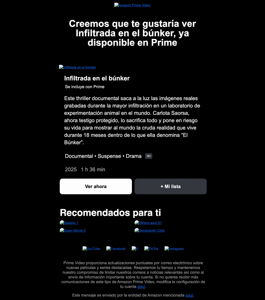
Imagine the impact: you send an important promotion, but the user can’t see anything because the images don’t load.

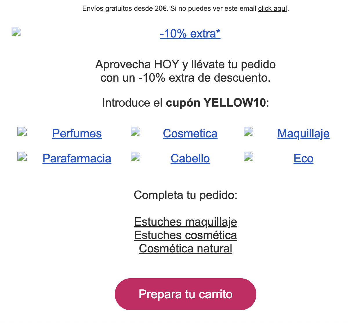
Therefore, you must always keep in mind that your images might not display. Remember to design your emails so they remain understandable and functional even when images are turned off.
👉Tip: You can also remind your subscribers to enable image viewing or add you to their safe sender list to enjoy the full experience.
Slow loading times
Images usually have a much larger size than plain text. If not optimized correctly, they can slow down the email loading, especially on slow connections or mobile devices. This directly affects the user experience and can increase the bounce rate, with many users deleting the email without waiting.
👉 Tip: ensure your images are optimized for mobile and compressed (here’s a post to learn how to do it). Add more content in plain text to balance the visual weight of the email and ensure a good experience.
Non-responsive design
A single image with all embedded content does not adapt correctly to all screen sizes. On mobile devices, it’s common for the text to appear small, making it difficult to read and reducing the message’s effectiveness. This can lead to:
- Blurry images
- Unreadable text
- Unclickable buttons
- Negative user experience
👉 Tip: A mobile-adapted email should include real text plus images, ensuring the message is understood with or without images and on any device. Nowadays, designing for mobile is not optional, it’s essential.
Content cannot be searched
Many users search for old emails in their inbox to retrieve offers, coupons, or specific information.
But if the content is within an image, it cannot be indexed or searched by keywords, nor can it be copied or pasted.
If all your text is embedded in images, the user won’t be able to find your email easily, reducing the lifespan of your campaigns.
Solutions and best practices
Now that you know why you shouldn’t send emails with images only, let’s see what you can do to improve your campaigns:
Combine real text with visual elements
Images should complement your message, not replace it. Make sure to include content in HTML text that can be read even if the images don’t load. This includes:
- Headlines
- Body of the message
- Calls to action (clickable buttons)
- Essential information (prices, dates, etc.)

Modular and responsive design
With more than 50% of openings occurring on mobile devices, you can’t risk sending emails that only look good on desktop. Use email marketing templates optimized for mobile and test your campaigns on different devices. These templates divide the content into blocks that automatically adapt to the device’s screen size, ensuring a smooth reading experience.
By the way, remember that all templates from Acumbamail are 100% responsive and you can also do device testing before sending your campaign 😉
Include alternative text (ALT) in images
The ALT text is an HTML tag that describes the content of an image. If the email client blocks the image, this text will appear as a replacement. The alternative text should be clear and descriptive, so the user knows what the image is about if it doesn’t display. Additionally, it improves accessibility for users who use screen readers.


Optimize the weight and format of images
Use formats like .webp or .jpg optimized for the web, and compress images without sacrificing quality. This reduces the loading time of the email, especially on mobile devices.
Avoid placing the call-to-action button inside an image
Instead of using a button within an image, create HTML buttons. This ensures they are always clickable and visible in all email clients, so the user can click even if the image doesn’t load.

Conclusion
While emails with images only may offer the greatest versatility in terms of design, their effectiveness is limited and can negatively affect your campaigns.
The key is to find the balance between visual design and functionality, combining images with text content that adapts to all devices and scenarios.
Before sending your next campaign, ask yourself: Does the message make sense even if the images aren’t visible? If the answer is no, it’s time to rethink the design.


