Visual Identity or Brand Manual: Do You Need One?
![]() Rocío Cortázar · 12 Feb, 2026 · Diseño Gráfico · 12 min
Rocío Cortázar · 12 Feb, 2026 · Diseño Gráfico · 12 min

We can all agree that the logo is the fundamental pillar of visual identity, but what good is it to have invested efforts and resources in having the perfect logo if later we cannot guarantee its correct use in every communication made to the audience?
The visual identity manual or brand manual (we will explain the difference between these two later) of a company is one of the most important documents when it comes to projecting the image the company wants to convey about itself. A corporation without a manual that includes the necessary rules for the use of its Visual Identity risks exponentially that its graphic projection may be carried out incorrectly every time it is executed, regardless of whether it is done by someone who belongs to the entity or not, thus conveying a fragmented and unprofessional image to our potential clients.
It is therefore essential that if you want to send a coherent, consistent, and cohesive message to the public, there are minimum rules to follow, set by the company itself, that leave no doubt when applying the brand in different scenarios. This way, we ensure that whoever uses our brand does so correctly, without manipulating, distorting, or perverting the meaning we have given it in its creation and which we want to reach the public.
Perhaps you have always thought that all this about the brand manual is something exclusive to large companies, and that being small, you only need a logo and little else. But that idea couldn’t be further from the truth.
Okay, but what is a visual identity manual?
The manual is a document where a compilation of all the guidelines to follow to maintain good graphic consistency is made, explaining how all the visual elements of the company should be used correctly, such as the logo, color palette, typography… in other words, everything that defines your brand visually.
It is worth making a distinction between a brand manual and a visual identity manual. Are they the same? The truth is, not entirely. In the visual identity manual, we will focus more on the purely graphic part of the company, while the brand manual contains intangible elements that go beyond the visual, such as tone of voice, philosophy, values, and even positioning towards the client.
Why do you need a brand manual?
Although we have already made it clear that a brand or visual identity manual is essential to ensure homogeneous communication, what other reasons do we have?
On one hand, it will save us time and resources. Imagine that every time a creative piece has to be made for the company, whether internally or externally through a collaborator, you had to explain all the visual specifications that must be met to ensure consistency across all communications, or worse yet, making corrections ad infinitum (if you are a designer, this will sound familiar). Thanks to the manual, the designer will have all the necessary information to start the task, which will facilitate everyone’s work and avoid wasting time on both sides. Additionally, in the case of working with multiple designers, they will all have the same information and starting guidelines, so we will avoid inconsistencies even if the content has been created by different professionals.
And on the other hand, having that consistency will improve our corporate image, which is the perception our client has of our company, not the visual part of the company as many people believe (but well, that’s another story).
What should a brand manual contain?
Large companies have very VERY extensive manuals, think of Coca-Cola for example, how many different media have you seen the brand applied to? All of that must be contemplated and designed in advance.
Each manual must have its own sections, derived from the unique nature of the brand. Therefore, smaller businesses should not take a large company as a reference, as their needs are not the same.
It is advisable to start from the key elements of your brand, what makes it unique, and make the necessary modifications from that point.
The manual is a living document, which adapts to new paradigm changes of the company itself, it is never completely finished, as reality is changing. So don’t worry if at first, you see your manual as too brief, besides that there is nothing wrong with that, you will see how as you grow and mark different milestones throughout your business history, your manual will grow in the same way.
Basic and recommended sections
Below we will list some of the most basic sections that any manual should contain, regardless of the size of the company. As we mentioned earlier, some of these sections may not be necessary in your manual, and it may be that, in the same way, you find that others are missing that are essential for your brand. So do not feel obliged to strictly follow the following list if you don’t feel it necessary and, of course, expand where you see fit. Of course, it is always a good starting point to have representative companies in your sector as a reference, to have an idea of where your brand stands visually and what the next steps and needs might be.
The brand
Most brand manuals begin with an introduction about the brand they address, its values and philosophy, as well as the tone of voice or any other aspect considered relevant. Some questions that can help you start writing this section are:
Who are you?
What is your story?
What do you do/sell?
What makes you special?
What needs do you intend to meet in society?
…
The logo
The logo is the most important part of corporate visual identity. It is what will define the rest of the brand’s applications. Therefore, in this section, we can address several topics related to the logo.
But first, it doesn’t hurt to make a small terminological distinction, since, although we use the word logo generically to refer to any graphic sign that represents a company, product, service, etc., this is not entirely correct.
Depending on which elements we find, we can talk about:
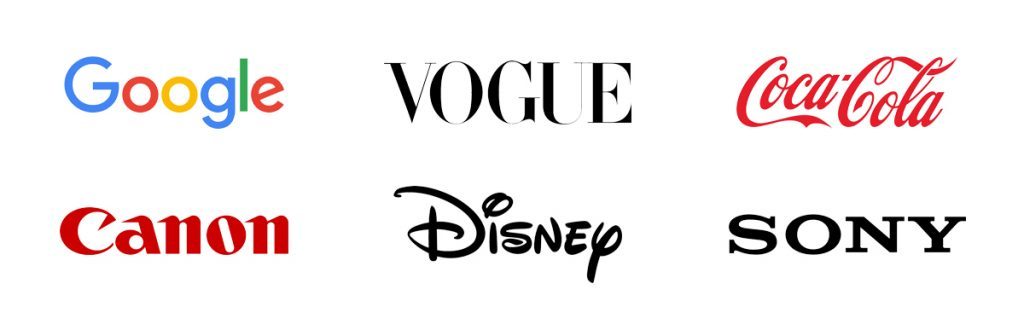
- Logotype: the logotype is only made up of typography (Coca-Cola, Walt Disney, or Canon)
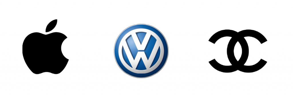
- Isotype: it is the symbolic or iconic part of the graphic representation, that is, when we represent the brand through a symbol or icon. The isotype has the ability to recall and identify the brand with just a glance (Apple, Volkswagen, or Chanel)
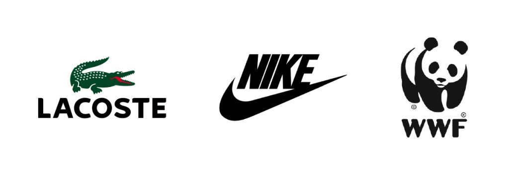
- Imagotype: it is the conjunction of the logotype and the isotype, that is, the graphic representation through one or more words and an icon. Both parts are well differentiated and can even function independently. It is probably the most abundant case, with examples like Nike, Lacoste.
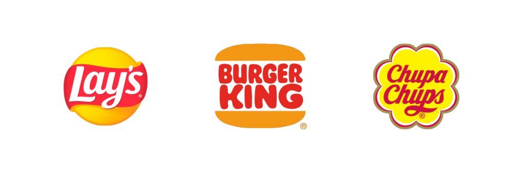
- Isologo: the isologo is also the combination of the textual part with the graphic part (logotype+isotype) but in this case, the union is indivisible, one does not work without the other, that is, they are fully integrated (Burger King, Lay’s, Chupa Chups).
Now you surely have no doubt about what kind of graphic representation yours is. This is important, as this aspect should be clearly specified, it is important to explain with what intention your “logotype” was created (in the rest of the post we will talk about logo/logotype as a generic term, to make it easier to explain the rest of the concepts).
Well, as we were saying, the logotype is a fundamental piece in your manual that will affect your visual identity in a significant way, so, in addition to adding a brief explanation about it and its relationship with what it represents, it is important to add other aspects such as:
Construction of the logotype
In this subsection, you should represent the logo on a grid and detail proportions and measurements of it. The intention of all this will be that the logotype always looks the same, regardless of whether it is increased or reduced in size.
Positive and negative version, color variations, and use on backgrounds
Every logotype must have a negative version, that is, in white (the positive being the original version in color). In many cases, this is as easy as coloring the original design in white, but in many others, it is not, especially if it is a complex logotype, things get complicated, and this transfer needs to be done very thoughtfully, if not done well, the result can be a somewhat grotesque and monstrous logo. But having this version is extremely important to ensure that in cases where dark backgrounds are used, our logo will be distinguished and identified perfectly. It is also important to specify in which colors the logotype can be reproduced (if it can be) and how those variations should be used concerning the background.
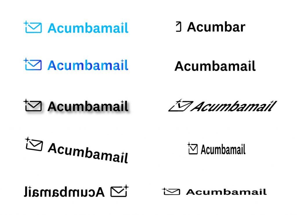
Incorrect uses of the logo
This section is a compilation of all the changes that SHOULD NOT be made to the logotype, such as distortions, incorrect color use, rotations, inclinations, narrowings, stretches, concealments, etc… Here once again, the incorrect uses of your logo will depend on how your logo is.
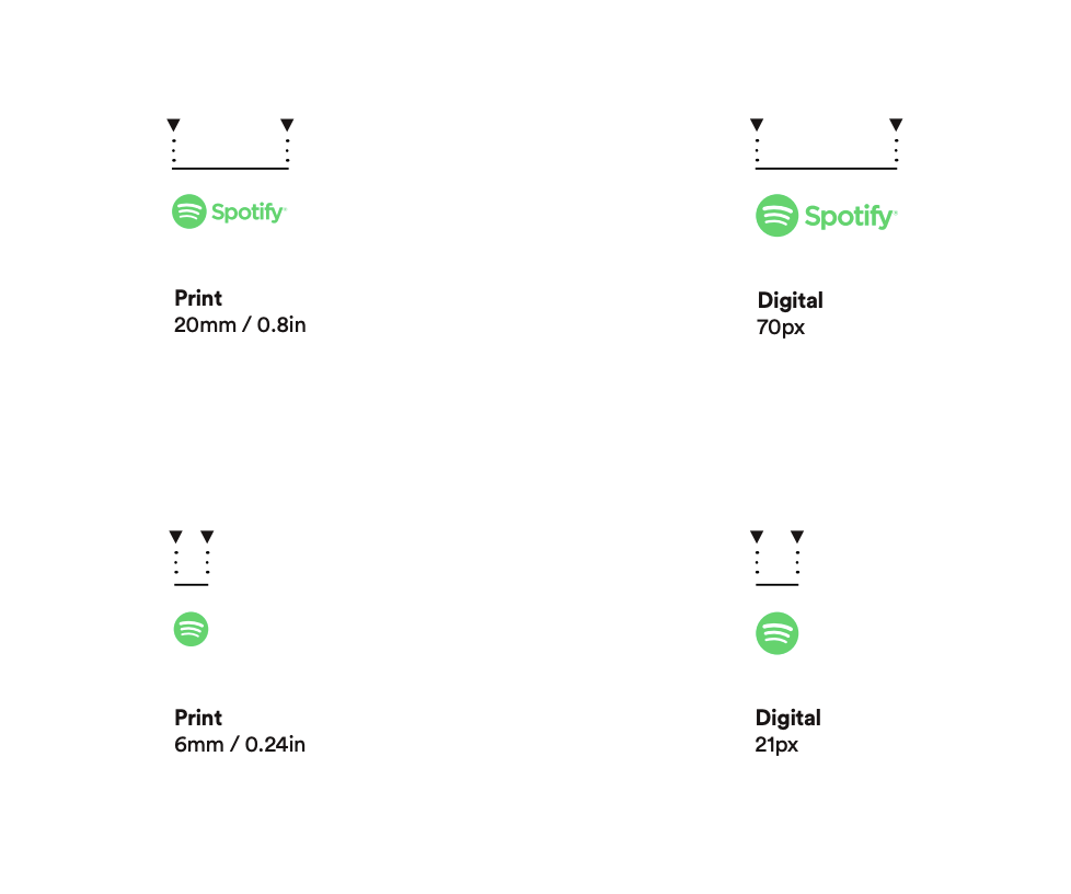
Reducibility
The reduction test consists of scaling the logo to establish the minimum size to which it can be reduced, without compromising its legibility, both on screens and in print.
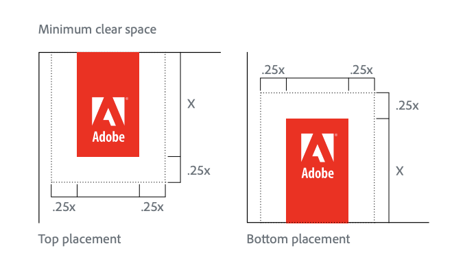
Safety area
The safety area attempts to establish minimum distances between the logo and other elements to ensure its correct perception. You can use elements of the logo itself to establish this distance or “air” of the logo.
Adaptability to different devices (responsive)
It is increasingly common for logos to have a responsive version, to ensure that even on devices with smaller screen sizes, they can be perfectly identified. It is entirely optional but highly recommended, especially if your activity is going to be primarily online.
Corporate typography
In the manual, it will be necessary to display all the chosen corporate typographies used, both inside and outside the logotype. The standard is usually to have a primary and a secondary typography, but there may be cases where there is only one main typography or up to three different ones.
In each case, the typography is shown including all the characters that make it up, that is, the letters from “A” to “Z” (uppercase and lowercase) and the numbers from 0 to 9, as well as the different typographic variables available for each specimen (thin, extralight, light, regular, book, bold, extrabold, black, italic, condensed, expanded, small caps, etc.) and any special uses of each of these variants if there are any.
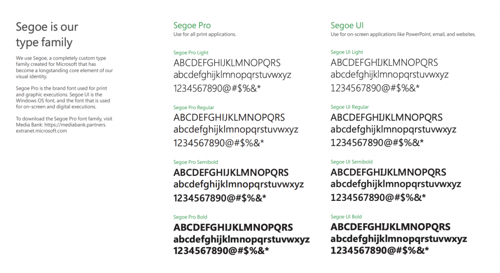
It is also very useful to designate a “web safe” typography as similar as possible to our main typography, for those cases where, due to web accessibility, the designated primary or secondary typography cannot be used. This way, we avoid opting for a typography that completely breaks with our visual identity in these cases.
Finally, it never hurts to add examples of the applied typography, to give an idea of the proportions between headlines and body text or to show the uses of the variants (this is something that can be applied to all sections).
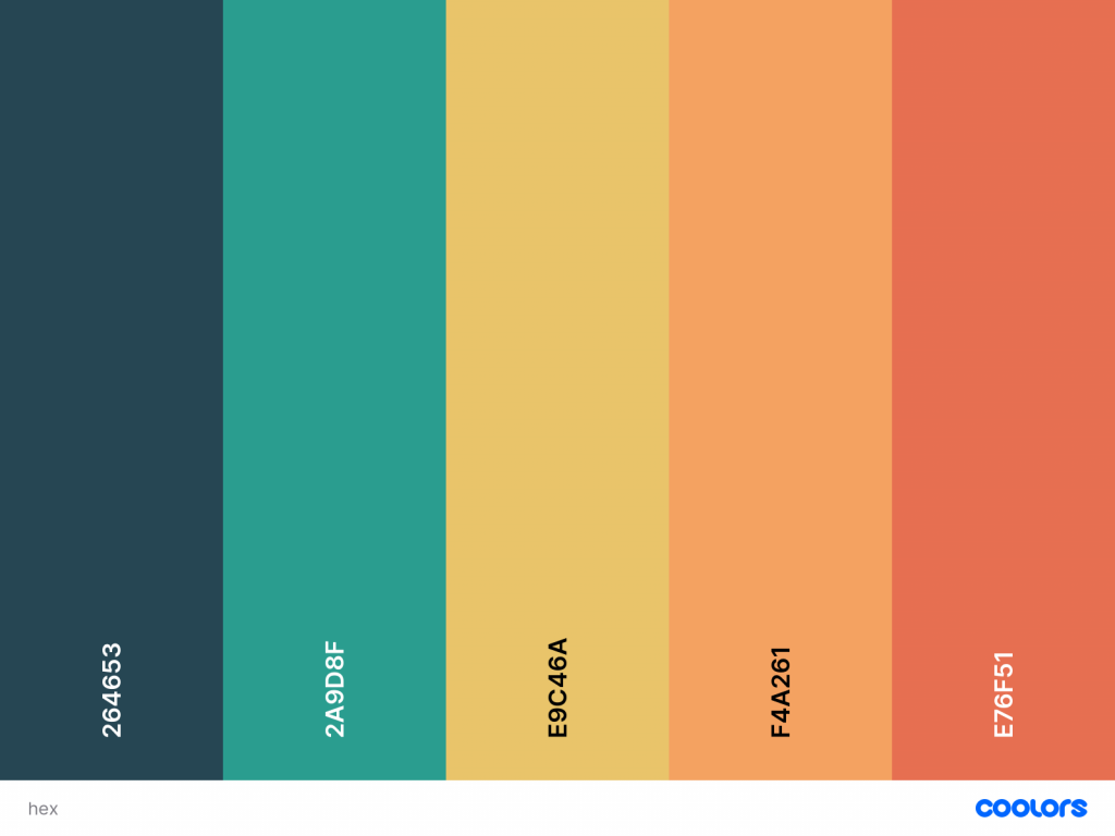
Corporate color palette
In this section, we must not only limit ourselves to identifying and describing the colors that may appear in our logo but also specify all those colors that will be present in the brand in some way.
If you have an extensive color palette (as is our case), it is important to explain what use each color has, so they are never used incorrectly. It also doesn’t hurt to create a color hierarchy, to further clarify which colors should be given preference and should predominate.
Of course, each color must be accompanied by all its information to ensure its perfect reproduction.
The values recommended to include are:
RGB
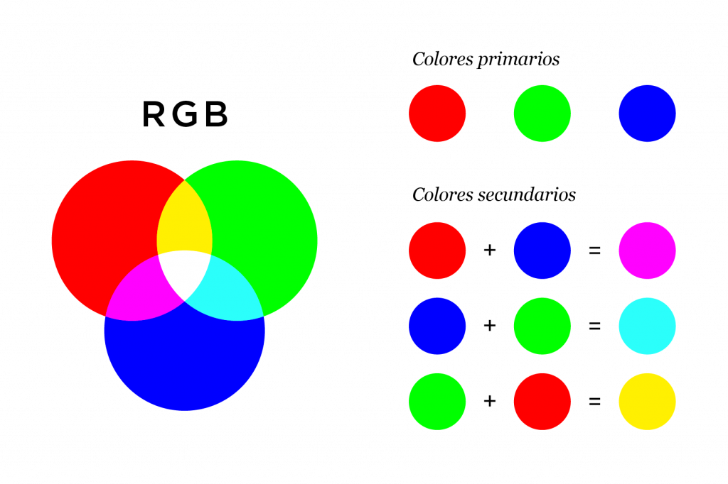
It is based on additive synthesis, with which it is possible to represent a color by mixing the three primary light colors: red (Red), green (Green), and blue (Blue). This color mode is mainly used for graphics that need to be reproduced on digital channels. They should never be used for printing.
CMYK
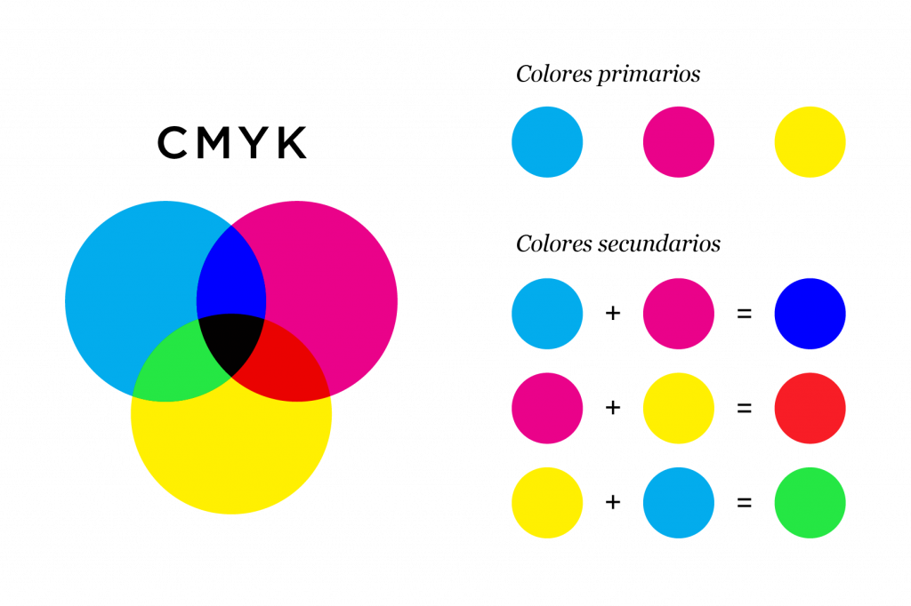
It is based on subtractive synthesis and mixes the following colors to create others: C = Cyan, M = Magenta, Y = Yellow, and K = Key (Black). This model should always be used when printing graphic elements on a physical medium.
HEX / Hexadecimal
It is a representation of the RGB mode formed by a 6-digit alphanumeric number, representing the color spectrum available for web design.
Pantone
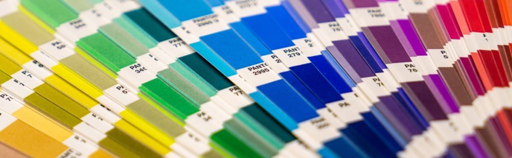
It is a standardized color guide identified with a code, also commonly referred to as solid color. This catalog is the most used in the world and has thousands of colors, and being a standardized system, it guarantees that the color will always be printed with the exact same tone, regardless of the medium or printer used. Therefore, this system is especially useful if you are going to make extensive use of printing on different media (stationery, packaging, product, screen printing, vinyl, stands, textiles…).
Icons and symbols
If your company has a specially designed icon system, it is necessary to include it in the manual, as well as any other signaling system used.
If the option to create new icons is considered, it will always be convenient to provide an explanation of how to create them, so there are guidelines to follow and consistency is ensured.
Photos, illustrations, patterns…

It is important that if your communication is going to use photos or illustrations, you specify very well what type of illustration and/or photography should be used.
Determine what criteria to follow to choose these resources, you can be as specific as you want, and ideally, you should add some examples to make it easier to understand, you know, a picture is worth a thousand words (or so they say).
If, for example, in the case of illustrations, they are entirely designed from scratch with a very specific style, then it is best to describe how to create them or the specifications that must be taken into account to faithfully reproduce the style of your brand.
Other components that can be added in this section are all those graphic elements with an intentional decorative character, such as patterns or watermarks.
Others
Here we will see some extra sections that may be useful for your brand, remember that, as we have said before, each brand is unique and has different needs, so perhaps these sections will be useful to you:
Applications
If, for example, your company is going to use stationery (envelopes, letterhead, business cards, folders, sheets of different formats, invoices…) it is necessary to design all these applications through mockups and examples.
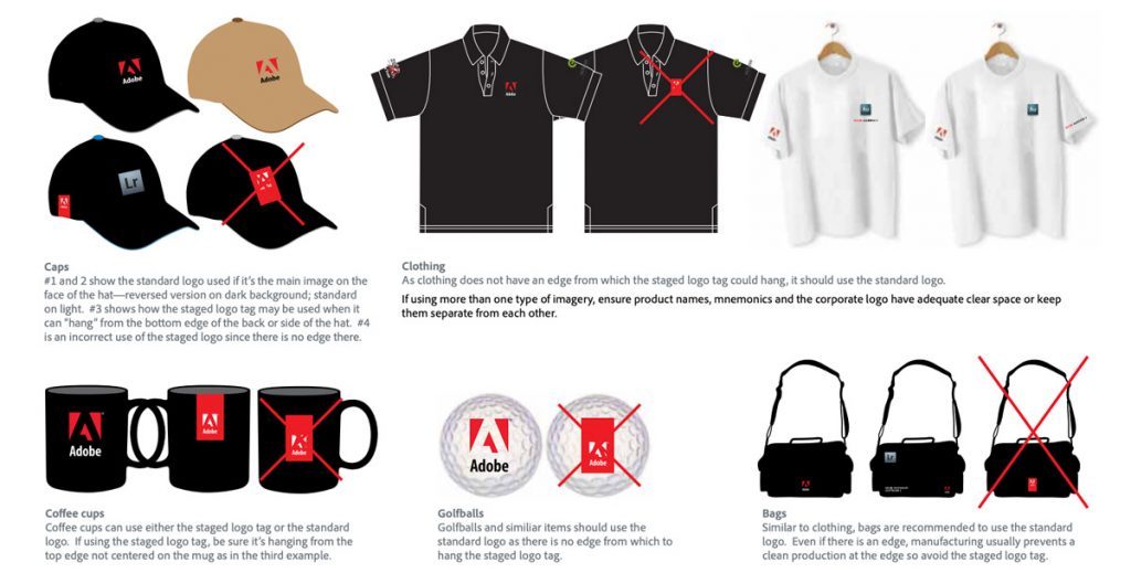
We can also find other applications such as merchandising (t-shirts, mugs, caps, pens, badges, bags… here the options are endless and can be adapted to each sector), packaging, uniforms, company vehicles, physical product (if you have it), etc.
As a reference, keep in mind that the ideal is to think in advance of all the places where your logo can be displayed, this way we anticipate possible errors that may lead to our brand being communicated incorrectly.
Audiovisual uses
The same applies to the digital medium and all the audiovisual content we can create. For example, it is necessary to consider how our avatar should be on different social networks, the animation of our logo in the introduction of our videos, the lower thirds, or any other animated element with a decorative character…
Finally, don’t forget to add a cover and an index where all the sections with their corresponding page numbers can be seen to facilitate navigation and reading, as well as the contact details at the end of the document, inviting all readers to contact your design department in case of doubt. It is also good practice to add the date of the last update and also the next sections that will be included in the document (if you have it planned).
In summary…
We can say that having a manual in your company is something that will save you time, costs, and resources, regardless of how basic or complex it is.
It is a really useful tool, especially if we are going to be working with collaborators outside the company (freelancers, agencies…). Believe me, they will appreciate, no matter how simple it is, having a document that gathers all the details of your brand that allows them to understand how all the graphic elements should interact with each other to ensure graphic consistency.
We leave you here the download link for our manual in case you want to take a look.

 Graphic Designer in Your Company")


