Adapt your emails to dark mode
![]() Rocío Cortázar · 12 Feb, 2026 · Diseño Gráfico · 5 min
Rocío Cortázar · 12 Feb, 2026 · Diseño Gráfico · 5 min

The “dark mode” is a display preference that has become very popular in email applications and mobile and desktop operating systems. When activated, dark mode changes the light colors of the user interface to darker tones (usually in shades of gray or black). This creates a new user experience that:
- Improves accessibility and reduces eye strain for those with light sensitivity.
- Extends the battery life of devices by reducing screen brightness and using less power.
- Offers a sleek and appealing dark interface that many prefer.
With the increase in user screen time, it’s clear why more and more people want this option.
It’s time for marketers and designers to stop ignoring dark mode when designing. Taking the extra step will enhance the user experience, ensuring your content is accessible to everyone while avoiding your emails being sent to the place that must not be named, i.e., the SPAM folder.
Things you can’t ignore about dark mode
More and more people are using dark mode. Almost all email clients have adopted their version, and users expect a consistent experience.
The number one rule is to consider and test how the content looks in dark mode versus light mode, focusing on creating a consistent, cohesive, and accessible experience for all.
The bad news: email clients are quite unpredictable.
There are three different ways email clients can change the appearance of your content when switching to dark mode:
- No change at all: In the case of Yahoo Mail and Apple Mail, emails look exactly the same.
- Partial color inversion: some email clients like Outlook only detect light-colored sections and convert them to darker colors.
- Total color inversion: Here everything is inverted. All light areas become dark and vice versa. This is what the Gmail app does.
As you can see, this only complicates things.
It’s important to ensure that designs are represented as best as possible in both light and dark modes. If readers don’t recognize where the email is coming from, they will ignore it, delete it, and may even unsubscribe. This will harm your deliverability rate in the long run. Take the extra step to ensure the reader’s experience is consistent and enjoyable, regardless of the mode they prefer.
How do I do it?
Designing for dark mode doesn’t have to be difficult. Here are some key points to consider when designing email marketing campaigns with dark mode:
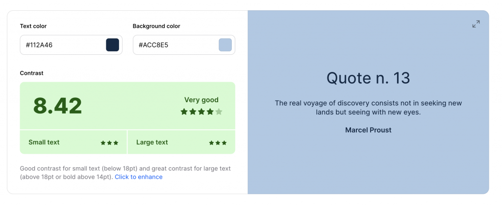
- Check the contrast: Ensure your emails have enough contrast in both light and dark modes. Colors may appear more muted in dark mode, so adjust the color palette to maintain readability. You can use tools like this one from Coolors.co, at least achieving a contrast of 5.
- Background colors: Background colors can be inverted in dark mode. Use solid colors and avoid background images that may get lost or make the text illegible.
- Text colors: Text should automatically change to a light color in dark mode. Make sure you’re not forcing a text color that could become unreadable.
- Images with transparencies: Use PNG images with transparencies so they look good on both light and dark backgrounds. Also remember to always optimize your images.


- Image borders: Consider adding borders to images to separate them from the dark background.
- Logos and branding: Ensure your logo and branding elements remain consistent and legible in both modes. If you can use a version of your logo that is neither black nor white, do so, ensuring the contrast with a light and black background is sufficient to guarantee its readability. If this is not possible within your branding, you can add a border or a glow effect of the same color as the (light) background to your black logo. In light mode, it won’t be noticeable because it will blend with the background, as they are the same color, and in dark mode, you can separate it from the black background.
- Maintain your brand identity: While it’s necessary to adjust colors and some graphic elements, try to maintain consistency with your brand’s visual identity.
- Accessibility for all: Dark mode is especially useful for users with light sensitivity or certain visual impairments. Ensure your email is accessible to everyone, regardless of the mode they prefer.
- Feedback: Gather user feedback on their dark mode experience and adjust your designs based on their preferences.
- Test trials: Test your emails on different clients and devices to ensure they look good in both light and dark modes.
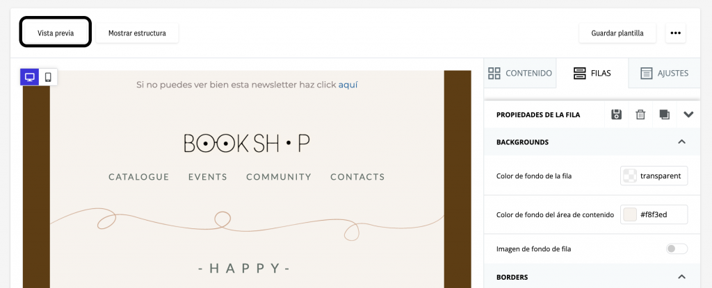
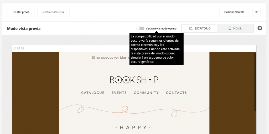
- Preview tool: All this is great, but how can I check that everything I’m implementing is working? Very easy, with our editor! Within the preview, you have a switch available to activate the “dark mode preview”. It’s not perfect, because we’ve already told you that email clients are unpredictable, but it will give you a very close result to what your recipients will see. You’ll identify and avoid potential design issues when an email is received by a reader who has dark mode enabled. This way, you can create more cohesive and consistent experiences for your readers without limitations based on the mode they choose to use.
Conclusion: dark mode in email marketing
And that’s our tutorial for working with dark mode in email marketing. Remembering these aspects will help ensure your email marketing campaigns are effective and appealing to all your subscribers, no matter how they choose to view their emails.


")


