11 Graphic Design Tricks for Non-Designers
![]() Rocío Cortázar · 12 Feb, 2026 · Diseño Gráfico · 5 min
Rocío Cortázar · 12 Feb, 2026 · Diseño Gráfico · 5 min

We have already talked about the importance of having a graphic design professional in your company (or at least outsourcing one), but we are aware that it’s not always possible, especially in the early stages of your business.
It could be said that design is art, but it also has a lot of science behind it (if you don’t believe me, read this article). That’s why we’re going to give you some graphic design tricks for non-designers. This way, you can create content with some basic guidelines to follow, which will make your designs look more attractive and cohesive.

Use Your Brand Colors
Colors are something fundamental in communication, and if you have a brand, it’s essential to be clear about your corporate colors.
Most likely, you already have a color palette that represents your company and what you do. So make sure to incorporate these colors into your designs. This will make it easier for your audience to identify you more easily and quickly.
If you don’t have a palette yet, create one
Although, as I mentioned, it’s normal to already have your corporate color palette defined, it might not be the case. Therefore, it’s important to create it before moving forward.
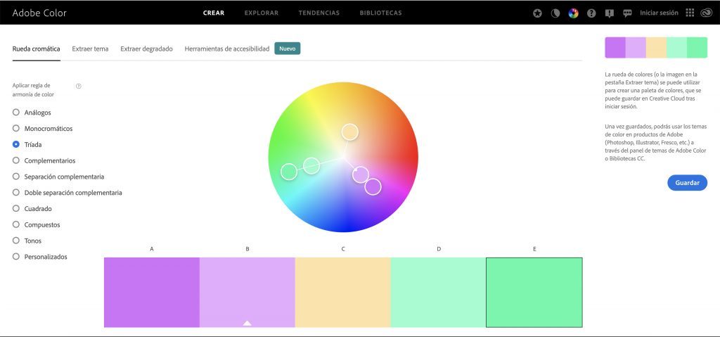
Focus on choosing colors that represent you, as well as colors that work well together without creating dissonance. Adobe Color is a great tool for creating palettes, as you can easily apply different color harmony rules (analogous, monochromatic, triad, complementary…) and freely adjust the colors independently.
Other tools that can also be useful are: COLOURlovers, Coolors, or Colormind. Don’t go crazy choosing too many colors, or you’ll end up with a chaotic result and too much visual noise that will overstimulate your audience. You can have an extensive color palette, but having it doesn’t mean you always have to use all the colors at once.
Consider the Psychology of Colors
When creating the color palette, it’s important that they reflect the tone of your brand. Don’t ignore the fact that, psychologically, colors evoke different feelings:
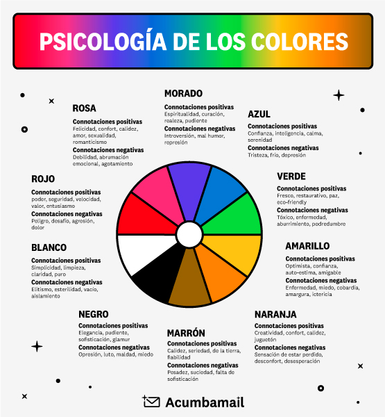
It’s important to consider the feelings evoked by your brand’s color palette when creating designs.
Think about blue, for example. Since it’s the color of trust and security, it’s no surprise that financial brands like PayPal or Visa use it as their primary color. Think about what you want your brand’s colors to convey to your customers. You can use color psychology in everything from your brand’s logo to your website design.
Don’t Underestimate the Power of Typography
Typography can be very powerful: it can set a tone and tell a story. Choosing a font that’s suitable for the occasion is crucial.
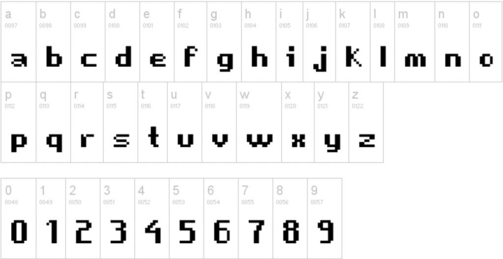
Can you imagine using the font above in a donor brochure for an organization fighting poverty? No. Think about the context when selecting a font.
If you have corporate fonts, don’t forget to use them whenever possible, and I also recommend choosing a font from the web safe list to have as an alternative when you can only use fonts from this list.
Limit the Number of Fonts
As I mentioned in the last paragraph, fonts have a lot of power, but that doesn’t mean we should abuse them in our designs. Using too many fonts, or worse, ones that are hard to read, will cause confusion for your audience. Try to limit yourself to two fonts that pair well and match the message you want to convey.

Mind the Alignment
What’s another thing that separates professional-looking designs from amateur ones? Alignment.
When aligning elements in your design, never do it by eye.
Most design programs have guides, grids, and even alignment tools available that will let you know if your elements are well-aligned.
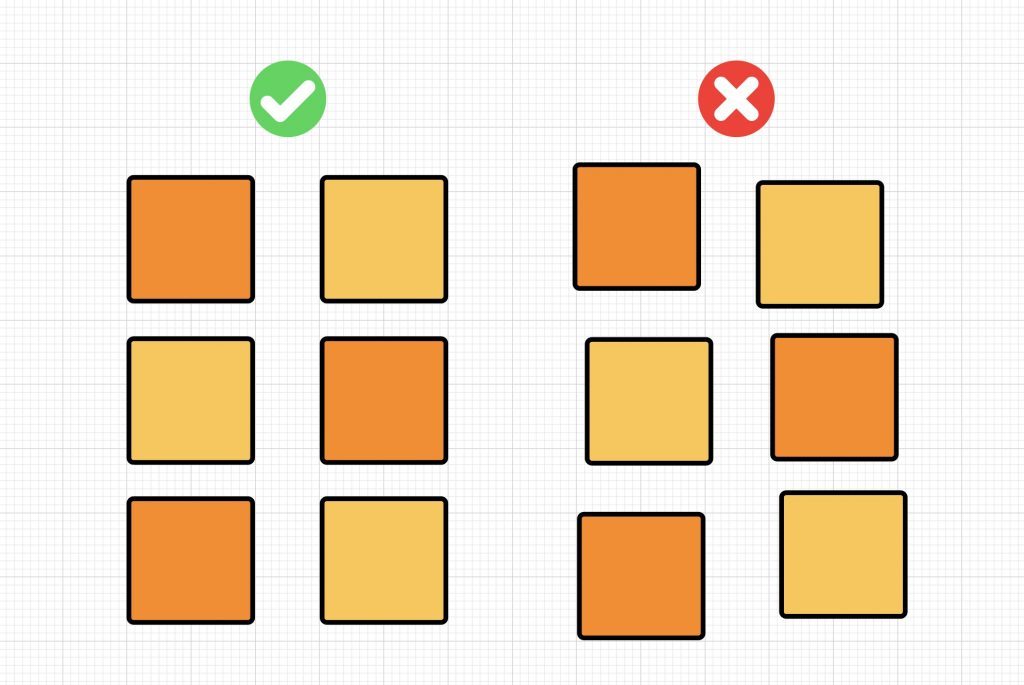
But be careful, because sometimes even if you have all the elements mathematically aligned, it might seem like they aren’t. This is where the eye of an expert designer comes in, who can determine the position of the elements according to their visual weight and not their dimensions.
Don’t obsess over aligning all texts and images to the center. You can mix different alignments to add uniqueness. Just make sure the alignment is consistent and doesn’t detract from your message.
Don’t Use Pure Black
Black offers us unmatched contrast but can be too harsh on the eyes. It simply doesn’t feel natural. And why is this? Well, because pure black doesn’t occur naturally, even if you think it does.
Instead, try using shades of dark gray (like #1b1b1b or #2f2f2f) instead of black.
Less is More
Ensure your designs are easy to understand. This includes selecting images, fonts, and colors that make sense in the context and the message you want to convey. It also means choosing concise copy with a clear call to action (CTA).
But be careful, being minimalist doesn’t mean losing the intentionality of what you’re doing.

Try to Convey Your Brand
With design, you have the opportunity to visually represent the heart and soul of your organization to the world.

Give It the Space It Needs
Not all empty space is bad. Use white space to create visual breaks and let the design “breathe”. This not only makes your design more visually appealing but also makes it easy to scan, read, and understand.
This is one of the design techniques that is more difficult to master than others. It’s not about filling everything with white spaces, but about leaving just the right amount of space that each element needs.
A good way to learn how to use white spaces is to study minimalist design. This is a movement that focuses on the idea that “less is more” and you only need the basics.
Another use of white space is called negative space. This is a technique where empty spaces tell more of a story than they would in the background or between other elements.

Use Size to Infer Hierarchy
Have you ever noticed that your eyes tend to be drawn to the larger elements on a page? Place the most important information in a large, bold font to show viewers what they should focus on the most. Then, use smaller sizes for less important information.

By applying these tricks, you’ll see how your designs improve substantially. However, remember, it’s not a recommended long-term practice; a professional will have these tricks fully integrated into their know-how along with many other more complex ones developed over years of experience.
 Graphic Designer in Your Company")


