Redesigns: When and Why They Are Necessary + Success Stories
![]() Rocío Cortázar · 12 Feb, 2026 · Diseño Gráfico · 6 min
Rocío Cortázar · 12 Feb, 2026 · Diseño Gráfico · 6 min
As you already know, if you usually read our posts, graphic design is more than just aesthetics. It is a powerful tool that directly affects a brand’s perception, which can strengthen its position in the market, or quite the opposite. Redesigning is nothing new; over the years, many companies have decided to redesign their visual identities to reinforce their relevance, emotional connection, and positioning in their sector. Today we will talk about some success stories, analyzing what made them effective and how they transformed these brands’ images.
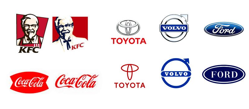
Why Redesign?
Before diving in, let’s look at the reasons behind a redesign. Some of the main motivations include:
- Staying relevant: Trends change, and designs that worked 10 years ago may seem outdated and not work today.
- Market expansion: When a company grows (through acquisitions or mergers), or even starts to occupy more international markets, it may need a more global or modern identity.
- Changes in mission or vision: Companies, like people, change and evolve over time, so adjusting their design to their purpose is important; this way, we will also see this evolution reflected.
- Repairing a bad perception: Design can help change a brand’s narrative. So if the current brand is associated with a negative experience, controversy, or business failure, redesigning is highly recommended.
- Changes in audience: If you want to attract a new demographic group, changes may be needed, as the interests, behaviors, or expectations of the new audience will be different.
- Recognition or differentiation issues: When the brand is too similar to the competition and the audience has trouble differentiating them.
Let’s see how these reasons applied in real cases.
Airbnb
In 2014, Airbnb went from being a promising startup to a global giant in the accommodation sector. With that growth came the need for a visual identity that captured its mission of connecting people through authentic experiences.
The original logo was generic text without personality or meaning. It did not convey the brand’s emotional values or its focus on people.
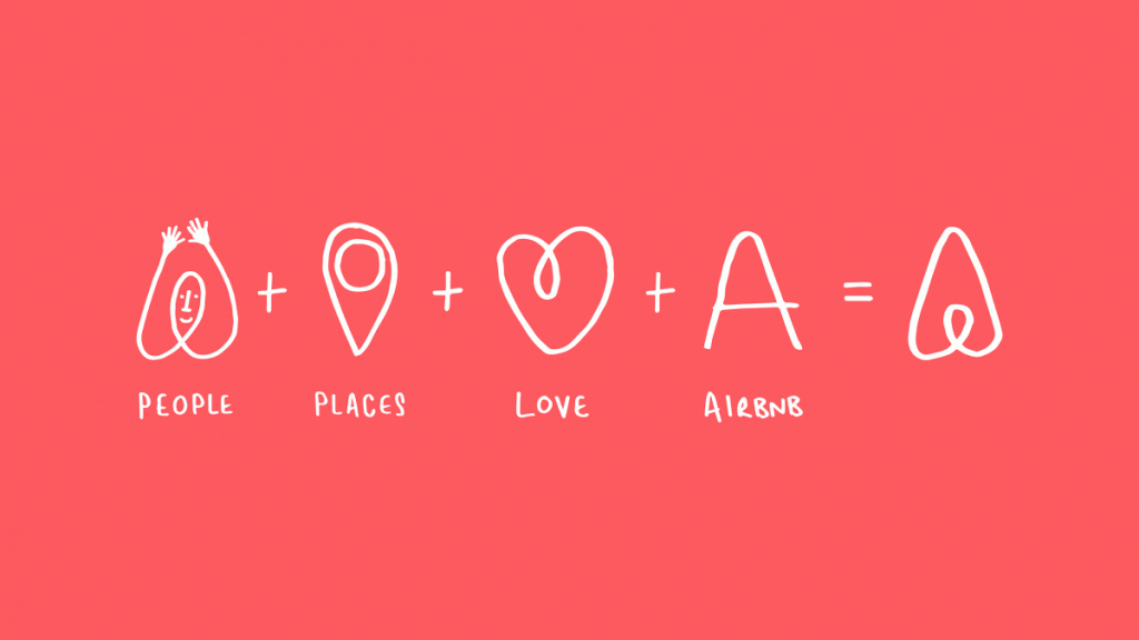
Airbnb introduced a completely new logo: the “Bélo.” This symbol represents belonging, love, and connection. Designed to be simple yet iconic, the Bélo is accompanied by a warmer color palette and a custom typography.
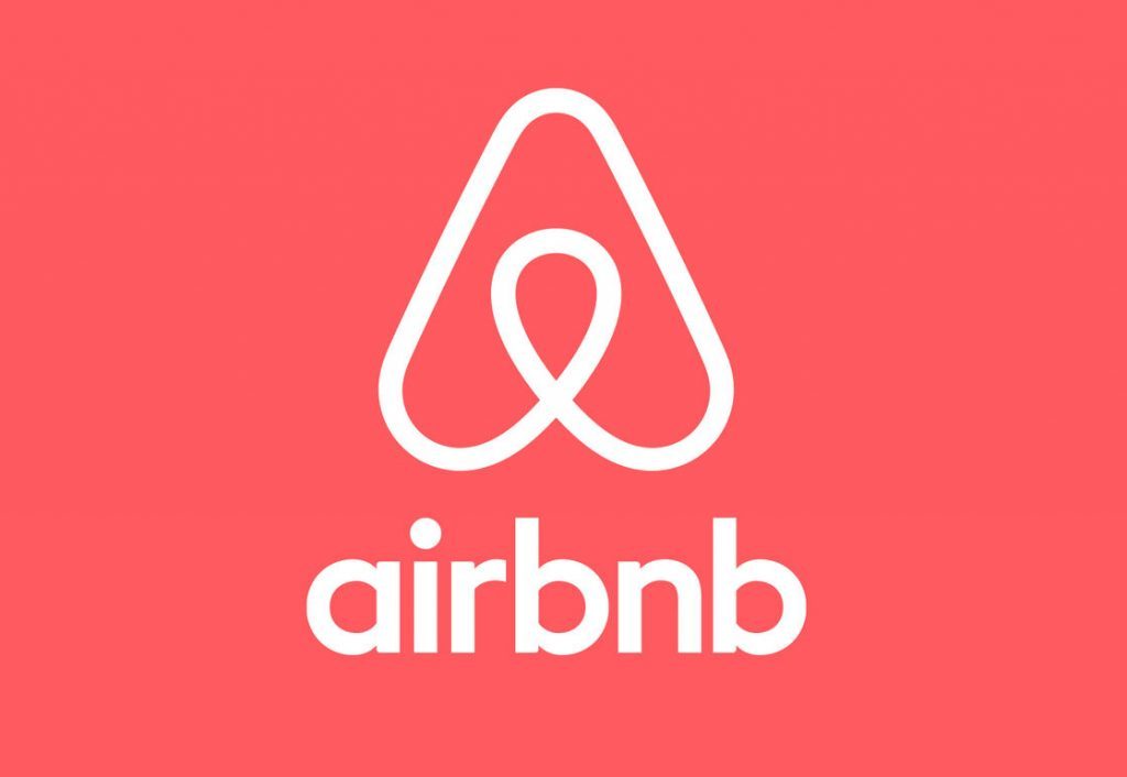
The redesign allowed Airbnb to position itself as a more human brand, connected with the values of community and hospitality. Moreover, the Bélo is versatile enough to be used in a variety of applications, from social media to physical signage.
Pepsi
Pepsi is a classic example of how a brand can stay relevant through the continuous evolution of its design. Although it has changed its logo more than ten times, each iteration has been a reflection of the era in which it was created.
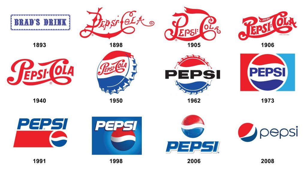
One of the most significant changes occurred in 2008, when Pepsi abandoned its classic logo with italic typography and rigid edges, opting for a more modern and dynamic design. The characteristic “wave” of the logo was redesigned as an asymmetrical circle.
This redesign helped differentiate Pepsi from its main competitor, Coca-Cola, and reinforced its image as a youthful and contemporary brand. Additionally, the simplified design facilitates its integration into digital platforms and modern packaging.
Burberry
Burberry, known for its British heritage and iconic tartan pattern, decided in 2018 that it was time to modernize its image. This coincided with the arrival of Riccardo Tisci as creative director.
The original logo had a classic serif typography, suitable for a brand with history, but less relevant for a younger and global audience.

The new logo, designed by Peter Saville, uses a modern and clean sans-serif typography. Additionally, Burberry introduced a new monogram combining the initials “TB” in homage to the founder, Thomas Burberry.

The change positioned Burberry as a contemporary luxury brand, maintaining its heritage while attracting a younger audience. The “TB” monogram also became a key element in products, creating a new versatile and recognizable visual identity.
The redesign of Google in 2015 marked an important milestone in its visual identity. The company decided to simplify its logo to better adapt to modern devices and the needs of a tech brand.
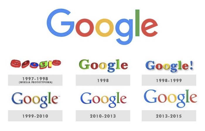
Google used a serif typography that, although iconic, was starting to look outdated and did not work well on small screens.
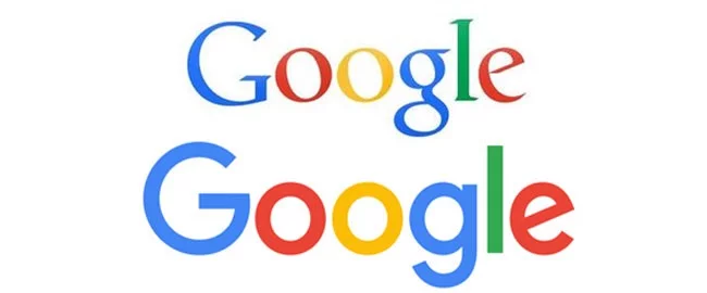
The new logo uses a custom sans-serif typography, maintaining the iconic colors but with a cleaner and more modern design.
The redesign improved legibility across all devices, from smartphones to smartwatches. Additionally, the animated logo, which transforms into colored dots, reinforces Google’s dynamic and innovative personality.
Acumbamail
Since the founding of Acumbamail in 2013, we have had a couple of redesigns, with the most recent and significant one in 2021.

This redesign was an integral process that sought to align the visual and functional identity with a more clean and modern user-centered approach. The visual proposal was reviewed, introducing changes in the logo, colors, and typography to reflect a more contemporary identity. This change also aimed to strengthen our positioning as an accessible and simple solution for small and medium-sized businesses in the competitive digital marketing sector.

This new image translated into a complete redesign of the platform to improve the user experience (UX), highlighting elements such as better menu organization, more intuitive interactions, and a redesign of the workflow to simplify key tasks like SMS and email marketing campaigns.
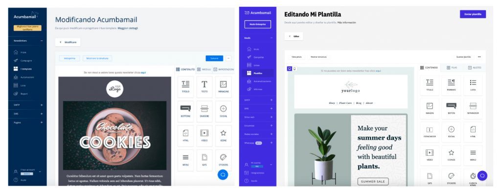
In terms of strategy, the rebranding not only improved the image but also reaffirmed our commitment to customer support and simplicity, aspects we highlight as essential. The change was communicated effectively to users to minimize resistance and reinforce trust in the new stage.
Key Elements of a Successful Redesign
These cases share some fundamental principles that you can apply if you are considering a redesign for your own brand:
- Clarity: The design must clearly communicate the brand’s values and mission.
- Simplicity: A clean and adaptable design works best across multiple platforms.
- Emotional Connection: Visual elements should resonate with the target audience.
- Versatility: A good design should work in digital, print, and physical formats.
In this post, we already talked about how to create a corporate design step by step.
A redesign can be a risk, but when done well, it has the power to revitalize a brand and strengthen its connection with the audience. Airbnb, Pepsi, Burberry, and Google are examples of how visual change not only transforms a company’s perception but also positions it for future success.
If you are thinking about redesigning your visual identity, remember that the key is not just to follow trends but to create something that is true to your brand’s values and goals. Good graphic design is more than appearance; it is a strategic investment in your business’s growth.


