How to Create the Perfect Footer for Your Emails
![]() Rocío Cortázar · 12 Feb, 2026 · Diseño Gráfico · 6 min
Rocío Cortázar · 12 Feb, 2026 · Diseño Gráfico · 6 min

The footer in emails is often overlooked, but it is a very important part of your newsletter design. Today we will talk about all the key elements you should include in your footer to achieve better engagement while also complying with the law.
It’s very common to see poorly thought-out and boring footers. This is a problem because, in most cases, it is where subscribers will look for key information about your company.
The footer is a good place where your recipients can contact you, learn more about you, and engage with your brand through external links, so don’t forget to give it a good review to optimize it!
The footer, within a newsletter, is the final section of the email. It can serve various purposes: from sharing information about your location, to legal matters, to encouraging conversation and engagement with your brand.
There are legal regulations that, to ensure consumer rights and safety are respected, require certain information to be included in all email marketing communications.
Unsubscription and data modification
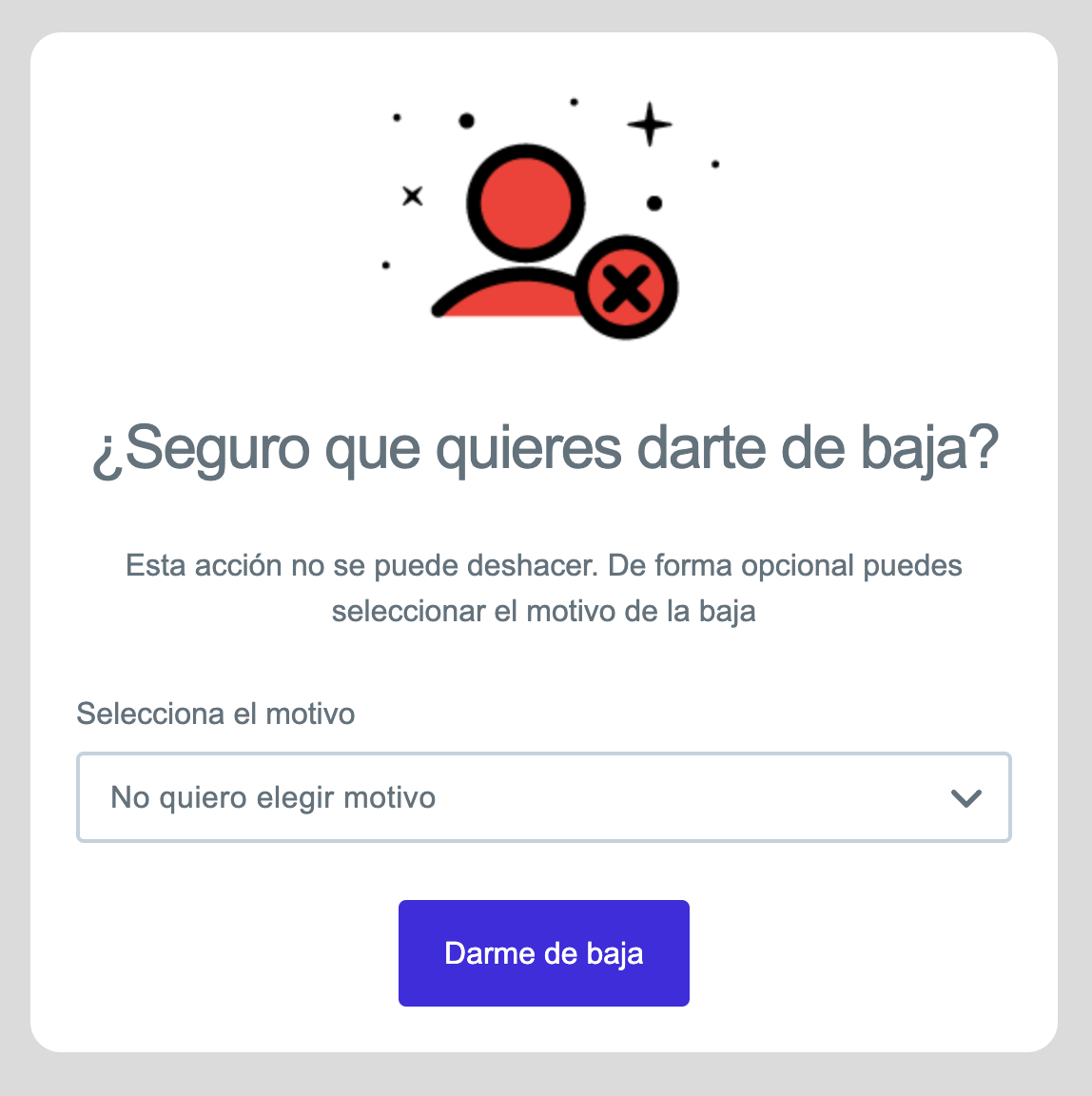
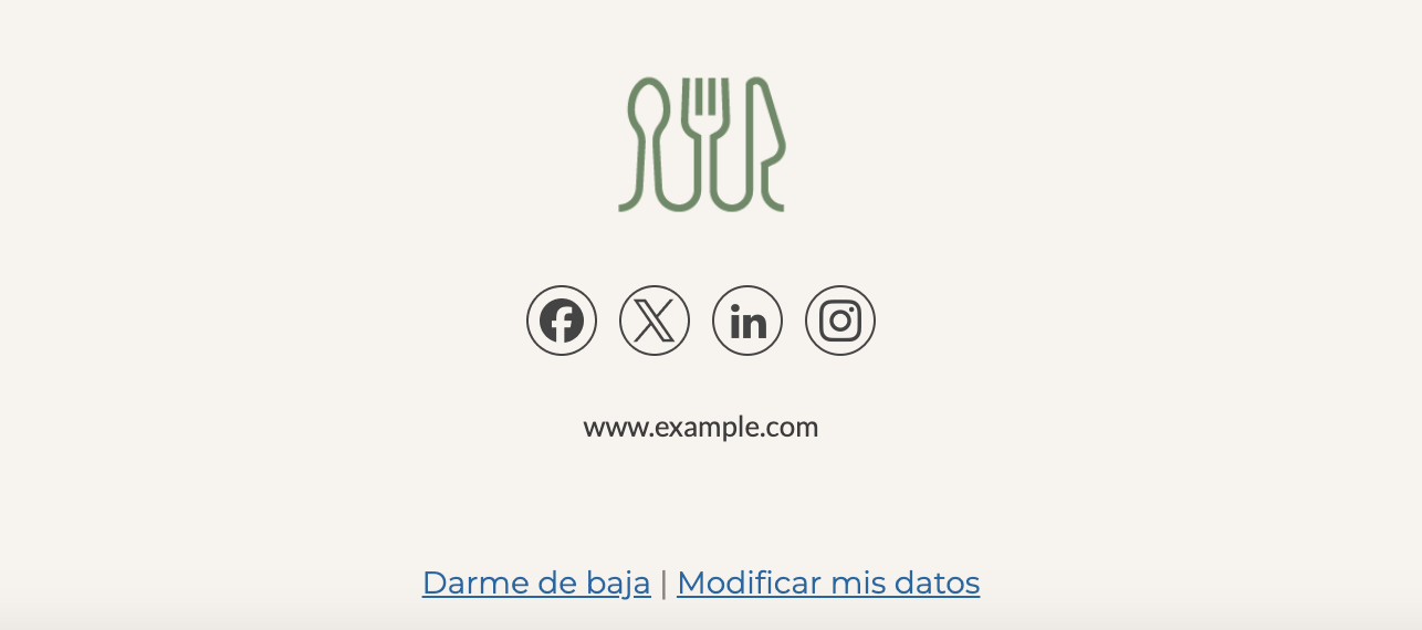
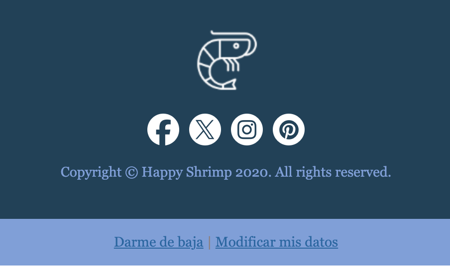
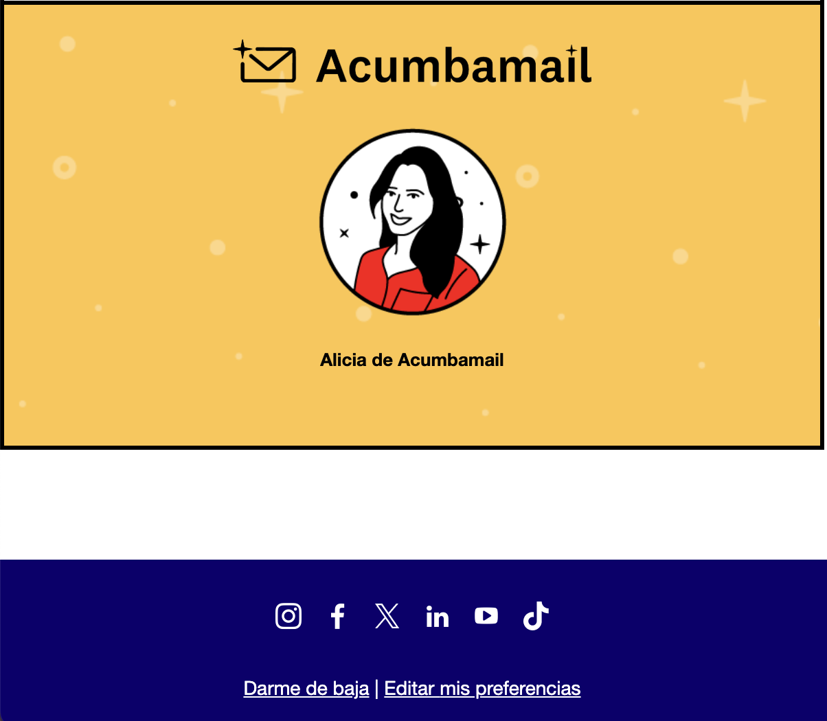
No one wants to lose subscribers from their lists, but it is mandatory to add a link that is easy and quick to identify to allow unsubscribing from your newsletter. Surely you’ve been in a situation where you wanted to unsubscribe from a brand’s communications but couldn’t find where or how to do it. If you hide this link, you will only generate frustration and anger from the recipients, which is not in your best interest. And the most important reason: IT IS ILLEGAL NOT TO INCLUDE THIS LINK.
It is much better to have a transparent communication and build good trust with your readers by giving them an easy way to leave your newsletter if they decide to do so. You can do this through a “Unsubscribe,” “Manage Preferences,” or “Email Preferences” link.
This link will take your subscribers directly to a page where they can unsubscribe, explaining the reason for their decision. This will show transparency on your part and prove that you are not trying to trap them in your mailing list. And it is better than being marked as spam.
If you use Acumbamail, you won’t have to worry about this issue because absolutely all our templates include this section, as well as another link for subscribers to modify their data.
Other recommended elements
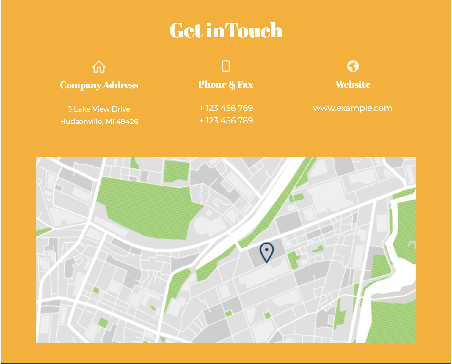
- Information about your business and contact. It is a very good practice to add contact information or, if possible, the address of your store, headquarters, or location in your footer.
- Why you are receiving this email. I don’t know about you, but most people are subscribed to a bunch of different newsletters, so it’s easy to forget why certain emails are arriving in your inbox. So reminding people why they are receiving your communications will always be a good practice that will reduce your spam complaints and help you maintain your reputation.
- Copyright. It doesn’t need to be too flashy; simply adding the copyright mark (©), the year, and the rights holder is more than enough.
- Offer details and restrictions. Often, it’s necessary to add some fine print about offers, discounts, etc., that are being communicated in the email. The footer is usually a good place to add these notes.
As we have explained, to comply with certain anti-spam laws, you must include certain data in your emails, but beyond those basic components, there is much more information you can add to enhance the impact of your email.
- Social media buttons. Social media buttons, as a secondary call to action, are usually found in the footer. They don’t distract from your email information nor do they steal attention from your main CTA. These icons will provide your subscribers with alternative ways to interact with your brand and stay updated on the latest news.
- Link to website. Your website is like your digital home, and if someone wants to know more about you, there’s no better place they can go. There they can soak up your personality and build trust with your brand, and who knows, maybe even make a purchase. If you add your identifying information like contact and location to create a relationship of transparency and trust, it’s very likely that if your recipients are interested in something from your email, they will be encouraged to visit your website.
- Share. Sometimes, when forwarding your emails, they don’t send correctly, leading to poor visualization. Therefore, many brands provide this link at the end of the email. Additionally, from a more marketing perspective, this will encourage your readers to share your content, a fact you can also track.
- Sign up. If your email is forwarded, it’s also useful to provide a link to sign up for the mailing list, so those new to your newsletter can subscribe easily and comfortably.
- Download app. If you have an app, email marketing is a great tool to raise awareness among your customers and encourage them to download and try it.
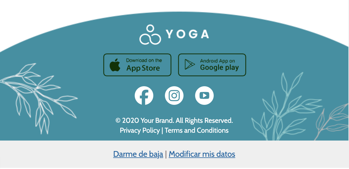
- Branding elements. Email marketing is a great opportunity to exploit your branding. So focus on using elements that can be easily associated with your brand. Adding your logo, colors, or corporate icons in your footer will help reinforce your brand visually and make your customers recognize you more quickly and think of you more often when they need to make a purchase related to your product or service.
- Keep it simple
The “less is more” mantra should always be your guide when it comes to email marketing design. It’s easy to fall into maximalism and end up with a footer full of text, buttons, images… Think carefully about what information is vital and stick to that. If the footer has too much information, it’s easy for readers to skip it. The simpler the footer, the more useful it will be to your recipients.
- Visual hierarchy
Once you have the basic information you will add to your footer, you need to organize this information in a hierarchical manner based on the actions you most want your subscribers to take and the information you consider most valuable to them.
- Organization
Organizing your footer into sections so that your content is presented clearly and orderly is important to improve readability.
- Choose the right color
Speaking of readability, the most important factor to ensure it is choosing the right color for both the background and the typography. Often, within an email, different background colors are used to visually separate different sections. This is one of the best ways to tell your reader “hey, the email is over.”
- Size matters
There is no foolproof rule for deciding how big or small your footer should be. As you design your email, you need to be aware of how much content you’re including to ensure your email isn’t cut off. If there is key content you need to prioritize, you may not be able to include a footer or will have to reduce it significantly, but if that’s not the case, you can afford to extend this section to give it importance. Between a compressed footer full of info and a more expanded one with fewer elements, it’s better to opt for the latter.


