Accessible Design: Create Emails Everyone Can Read and Enjoy
![]() Rocío Cortázar · 12 Feb, 2026 · Diseño Gráfico · 7 min
Rocío Cortázar · 12 Feb, 2026 · Diseño Gráfico · 7 min

Designing an email is not just about choosing pretty colors or eye-catching images. It also involves ensuring that everyone, regardless of their visual, cognitive, or motor abilities, can read, understand, and interact with the content. Visual accessibility in email design is not an option: it is a necessity.
Why is visual accessibility important?
Most designers tend to think of their audience as if everyone sees the world the same way they do. But that is far from reality. Visual impairments, whether permanent, temporary, or situational, affect millions of people. From color blindness to age-related vision loss, it is essential to design with all users in mind.
Key visual conditions to consider
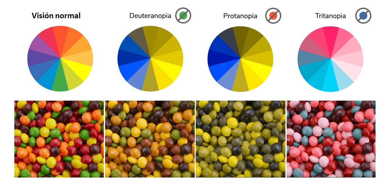
1. Color blindnessAffects approximately 8% of men and 0.5% of women. There are various types, including:
- Tritanopia: confusion between blue and green, and between yellow and violet.
- Deuteranopia: reds appear lighter and are confused with green.
- Protanopia: pinks appear blue and dark reds are confused with black.
- Red-green blindness: a combination of the two above.
Color blindness is one of the main reasons we need to be concerned about the proper use of color, contrast, and visual elements like underlines in links when designing accessible emails.
2. Visual acuity issuesYour visual acuity is the ability of your eyes to distinguish shapes and details of objects, and it works together with your perception of color and depth to determine how well you see. The most common conditions related to visual acuity include:
- Astigmatismo, una distorsión de la córnea y provoca que las formas y objetos se vean borrosos o distorsionados.
- Miopía, que permite ver con claridad los objetos cercanos, pero hace que los objetos lejanos se vean borrosos.
- Hipermetropía, que permite ver con claridad los objetos lejanos, pero hace que los objetos cercanos se vean borrosos.
Although many are corrected with glasses and contact lenses, they remain an important factor to consider.
3. Vision loss or eye diseases
More severe, and generally more complicated to treat, are the diseases and disorders that damage the nerves or blood vessels in and around the eye.
- Macular degeneration: loss of central vision.
- Glaucoma: affects peripheral vision.
- Diabetic retinopathy: damages the blood vessels of the eye tissue and causes dark spots or blind areas throughout the visual field.
- Cataracts: the lens of the eye develops cloudy areas, which can result in blurred or faded vision, halos, and difficulty seeing in very bright or very dark environments.
Additionally, situational factors such as low screen brightness, direct sunlight, or external distractions can make reading difficult, even for people with good vision.
For example, dyslexic people, although they may have great visual acuity, can experience difficulties reading long or complex text blocks. While we take steps to write shorter and easier-to-read texts, it is important to consider how elements are visually presented for these users.
Design principles for accessible emails
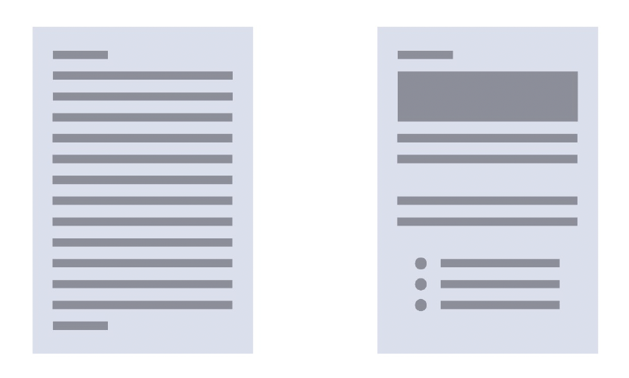
1. Clear visual hierarchy
One of the best things you can do to increase the usability of your emails is to organize the information so that the reader can easily scan the content and detect what is most important. To do this, you can use:
- Content size: headlines should be larger than the body text. Think about newspapers, for example, the first thing you see are the big headlines, right? The same goes for your emails. If the headline contains the most important information (aside from the CTA itself) in an email, make it larger.
- Color: The color of elements can also be used to reinforce hierarchy. But try not to rely solely on it to convey the importance of an element, as people perceive colors differently, so what is obvious to you may not be to your subscribers. As a general rule: dark and saturated tones draw more attention; light ones serve as secondary information.
- Location and spacing: location and spacing go hand in hand, allowing you to group related information and create sections within your email. These sections effectively reinforce hierarchy. The most important content should be at the beginning and properly separated to facilitate reading.
The combined use of size, color, location, and spacing will help you create a hierarchy in your emails and, more importantly, allow you to offer more accessible experiences for your subscribers.
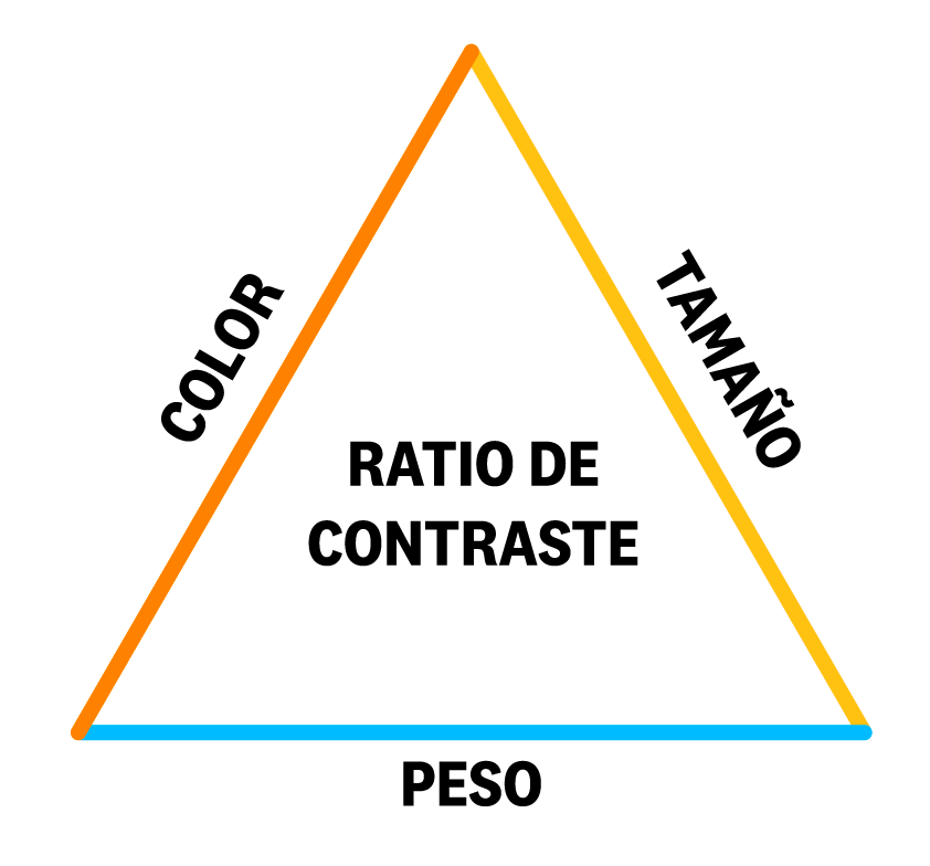
2. Contrast and use of color
Contrast is the difference between two elements. In general, it refers to the color difference between background and foreground elements in an email. That said, the size and thickness of the font also influence contrast.
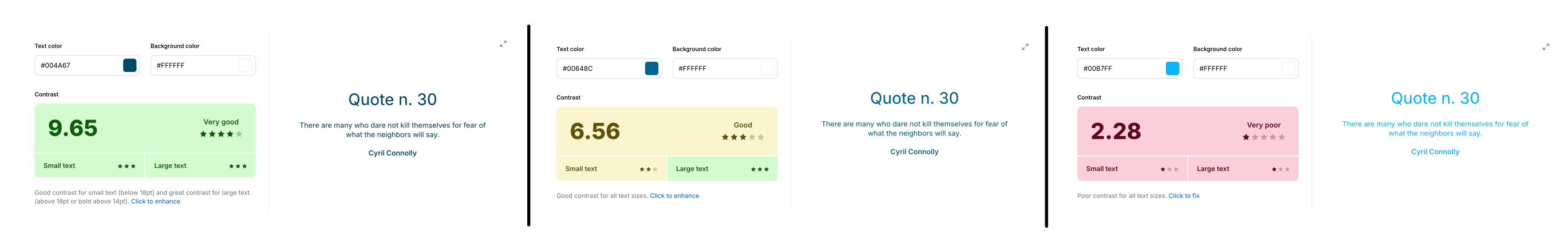
The contrast between text and background must be high enough to ensure legibility. The recommended guidelines are:
- Minimum contrast level: should be above 4.5 for normal text, and above 3 for large text or bold.
- Optimal contrast level: should be above 7 for normal text, and above 4.5 for large text or bold.
You can check the contrast between colors with the Coolors.co tool.
Additionally, never rely solely on color to convey information. For example, links should not be differentiated only by their color, they should also have an underline or another visual indicator. This will help users with color blindness, who may not be able to differentiate between the text color and the link color.

3. Readable text
Design also affects readability:
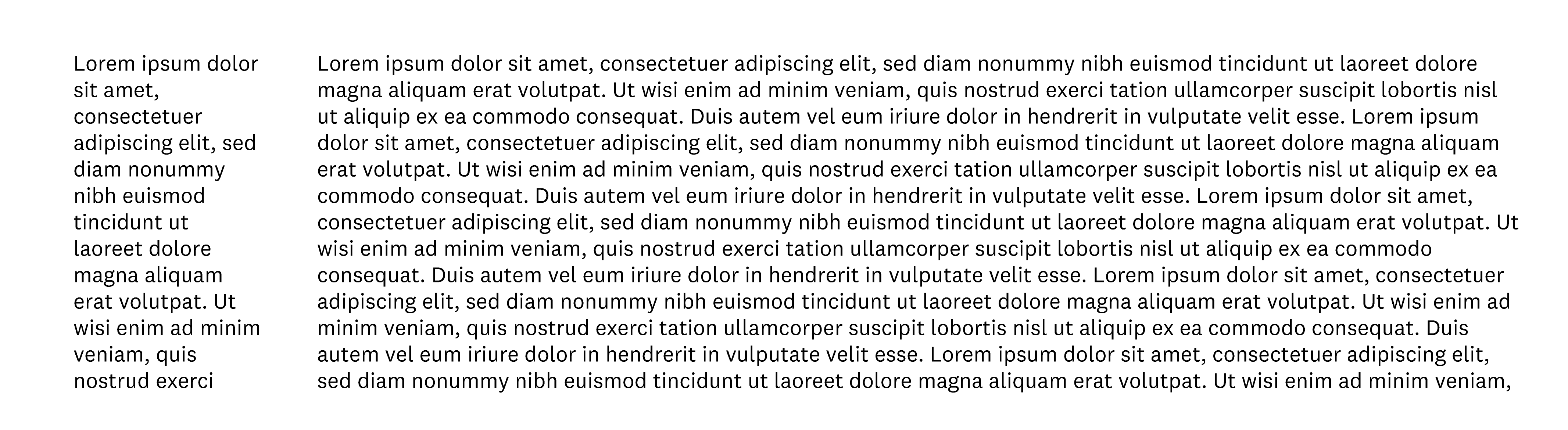
- Line length: refers to how long a line of text is before it moves to the next line. If the lines are too short, they force the user’s eyes to move very quickly and can cause fatigue. It also means you will have more lines and force the user to do a lot of scrolling. If the lines are too long, it makes reading difficult, as the user has to spend more time finding the start of the next line; physically, there is more distance to cover with the eyes. Ideally, it is between 50 and 85 characters per line.
- Line spacing (leading): too little space between lines makes the text look cramped and difficult to read; too much space makes the lines appear disconnected. Smaller text (like body text) generally requires more space between lines. Larger text (like headlines) can allow less space between lines. This point is not as simple as it seems, as it depends heavily on the fonts used, the length of the content, and the aesthetics you are aiming for. Experiment until you find the ideal leading that works for your email campaign.
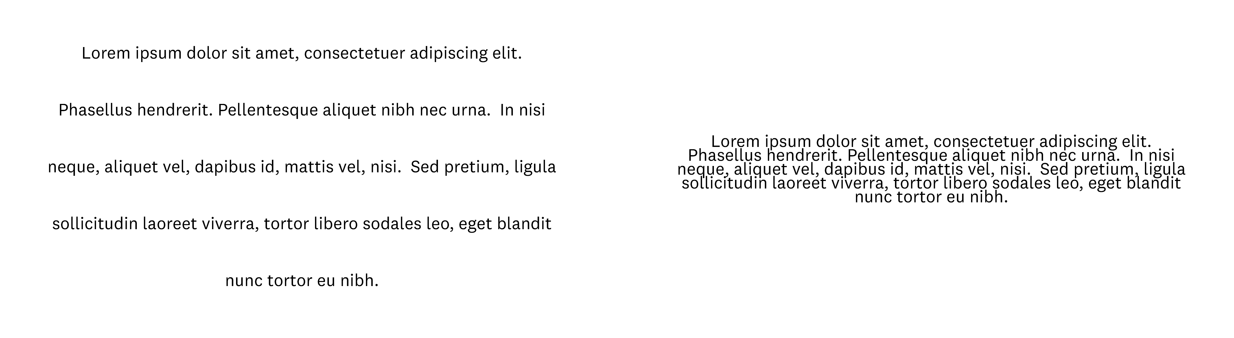
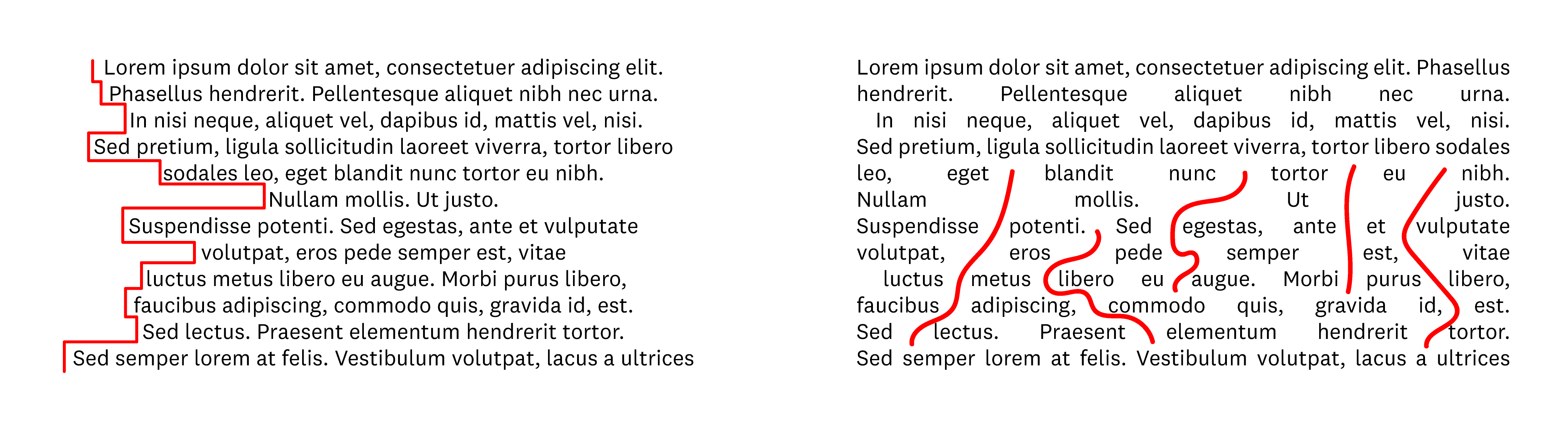
- Alignment: alignment is important because it helps the reader’s eyes have a consistent starting point for new lines, especially in long text blocks. Without that consistency, the text becomes difficult to read, especially considering the little time most people spend reading emails. Long texts should be left-aligned (in languages read from left to right) or right-aligned (in languages read from right to left). Although centered text provides symmetry to the design, if it is too long, it can complicate reading. As a rule, only center texts that are shorter than 3 lines. Something similar happens with justified text (which forces word spacing to align both left and right sides), creating “rivers” of white spaces that make reading difficult.
4. Accessible layouts
By layout, we mean the arrangement of graphic elements within a given medium, in this case specifically within an email.
In emails, this distribution can vary from simple designs with a single column to more complex ones with multiple sections, columns, and varied element sizes. These elements can be well-spaced or crowded together. And each variation affects how easily someone can scan and understand the information in a campaign.
As with text, layouts tend to work better when they are simple and logical. Complex designs can create a sense of overload for users. They can be easily distracted by different elements and may find it difficult to focus on just one. Complex designs, at least when not carefully crafted, can also dilute the hierarchy that you have spent so much time creating and nurturing.
Therefore, it is ideal to maintain a single-column design, adding sections with more columns sporadically if necessary. This way, you can guide the subscriber’s reading much more easily, avoiding creating multiple simultaneous reading paths that could distract the recipient.
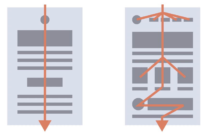
This does not mean that all your emails have to have a single column, especially if you have a lot of information to convey, as otherwise, you will have a design that is too long and will tire subscribers. If that’s the case, you can use a “Z” or zigzag design, which is effective for presenting a lot of information in a relatively compact way and also allows you to guide users through that information.

Responsive
Another key aspect of accessibility is ensuring your template is responsive, meaning it adapts to other devices like mobiles, as many openings occur through them. I take this opportunity to remind you that all Acumbamail templates are 100% responsive 😉
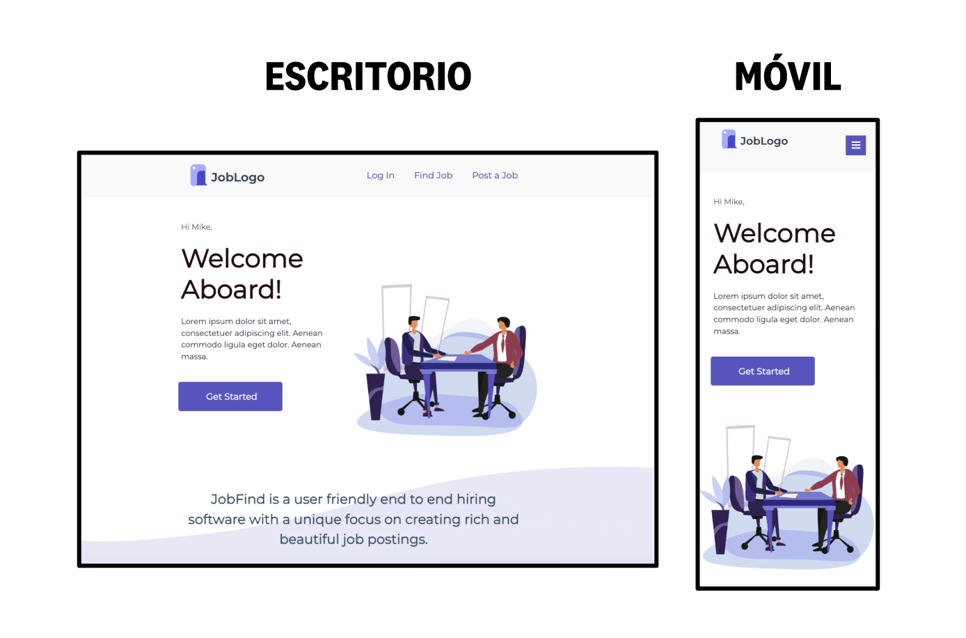
For mobile, longer emails are usually fine (within reason), as people are used to scrolling on small devices. But the limited screen space of mobiles makes complex designs feel even more cramped, and they often cause legibility and readability issues.
Therefore, you should strive to use stackable responsive designs, especially in the case of more elaborate designs, so that on mobile, they always become a single column.
Conclusion
Designing accessible emails does not mean limiting creativity, but using it more consciously. Every choice you make, from font size to button color, impacts the user experience. Ensure that all your subscribers, regardless of their abilities, can enjoy the content you worked so hard to create. Accessibility is not a trend. It is a responsibility.

")


